6 finishing touches that make any home look professionally designed
For years, I thought getting that designer look meant buying all new furniture.
New sofa. New rug. New everything.
Then I started analyzing what made certain spaces feel complete.
And I noticed something:
They obsess over the finishing touches.
The way colours repeat across a room.
How textures mix.
The way light hits different surfaces at different times of day.
These details quietly transform a space from "nice" to "I need to know who designed this."
The brilliant part?
You don't need to renovate. You can add these touches to the home you have right now.
Here's exactly what to focus on:
1. Start With a Cohesive Colour Palette
Ever walked into a professionally designed space and thought, "this just feels right"?
Nine times out of ten, it's the colours.
They're deliberately chosen. And repeated throughout the space.
Here's the rule I follow:
Start with five colours:
Two colours you love that contrast nicely
Two neutrals to ground everything
One "wild card" for visual interest
Then comes the important bit: tonal variation and repetition.
Use different shades of your chosen colours across the space. This creates depth.
A little hack I use? Paint decks.
They show you tones that naturally flow together, keeping everything cohesive while maintaining visual interest.


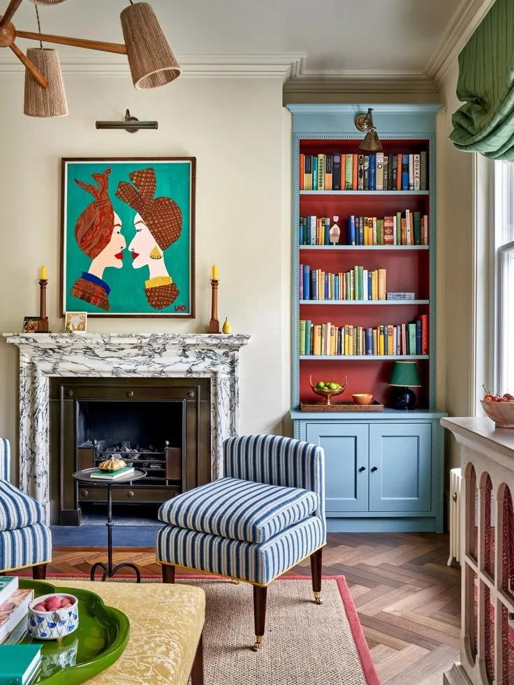
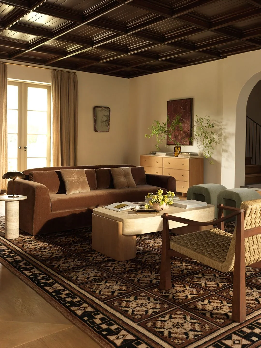
Michael Sinclair (left) & Owen Gale (right)
Look at how the first space (left) uses red as its wild card but repeats it in slightly different shades.
Then the second space (Right) pairs slate blue and green with white and light grey neutrals, finishing with pink chairs as the wild card.
This intentional repetition is what makes a space feel designed rather than decorated.
2. Layer Your Lighting
Want to know the fastest way to kill a designer look?
Only use overhead lights.
Designers always layer light at three levels:
Above eye level: ceiling lights or pendants
Eye level: wall sconces or floor lamps
Below eye level: table lamps, LED strips, accent lighting
If you want to decorate like a pro, you need at least three light sources per room. In addition to your ceiling lights.

Boz Gagovski
Notice how both example spaces use wall sconces for that crucial eye-level lighting?
That's not an accident.
3. Mix Textures
Designers mix materials on purpose.
Wood, metal, stone, linen, cotton, wool, velvet.
They all catch light differently. They all add depth.
My quick tips:
Favour natural fibres - they look, feel, and wear better than synthetics
Mix finishes - rough and smooth, matte and glossy, soft and hard
Use textiles as a quick fix if your space lacks textural variation (cushions, throws, rugs, curtains)
It's about the small details.
How can the grain of a basket elevate your space? What about the subtle sheen of glazed ceramic?

Studio Pulp
Count the textures in the above spaces. You'll find at least 6-8 different materials working together.
4. Bring in Plants
Every professional designer I know uses plants.
They're natural mood boosters.
A single tall plant in a corner. A simple branch in a vase. Either can completely transform a space.
And yes, faux plants work too.
Just bend and fluff them so they don't have that stiff, obviously fake look.


Photo by Derek Swalwell (left) & Photo by Catherine Dash (right)
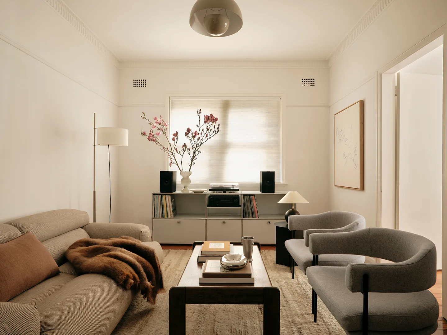
Photo by Nic Gossage
5. Curate Your Styling
Most people decorate shelves by buying random objects and hoping they work.
Designers don't leave it to chance.
They use still life styling - composing surfaces like they're creating a photo or painting.
Here's how:
Start with an anchor - a mirror, art, or large vase that gives the eye a starting point
Add height - tall objects like lamps or candlesticks for visual interest
Layer mid-height pieces - stacks of books, sculptures, bowls
Finish with small accents - trinkets and tiny objects for personality
The trick is variation.
Mix heights, shapes, and textures. Overlap objects slightly instead of spacing everything evenly.
This instantly looks more designed.

Photo by Paul Massey
Varying heights is the secret to great styling.
6. Go Big with Art
If a room feels unfinished, oversized art or a large mirror will anchor the space.
Small pieces can work, but placement matters.
Designers never put small art on large walls or above large furniture. It gets lost.
Instead, they use a single large piece that fills the space and balances visual weight.
Gallery walls work too - but keep pieces close together and treat the group as one cohesive unit.
Pro tip: Step back and check the scale. When in doubt, bigger almost always wins.
Cheers,
Reynard