8 Color Combinations that Seem Wild but Totally Work
Selecting colors for your home sounds easy–until you actually start doing it, especially if you don’t want to play it safe with neutrals.
Now, I’d recommend first watching my video guide on How To Use Colour In Your Home - Choosing Colour Palettes & Pairings That Work and a past edition of this newsletter where I talked about how to use color in your home.
It covers the basics of color theory and walks you through building a palette step by step (the newsletter article is especially helpful).
But if you’re after some quick inspiration, you’re in the right place. We’ve put together eight unexpected color combinations that might sound daring, but trust me, they’ll give your space a bold, unique flair! Let’s get into them!
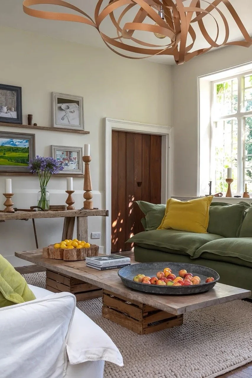
1. Light Blue & Mustard
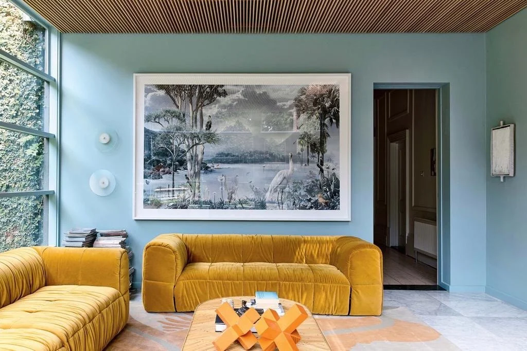
Yellow is always a really daring colour to use in interiors and it paired with blue is definitely something unexpected. I like how they’ve enveloped the walls in pale blue in this living room and added in a pop of colour with the two plush mustard couches. It adds in so much warmth and personality to the room while the light blue keeps things from getting too chaotic.
2. Lavender & Navy Blue
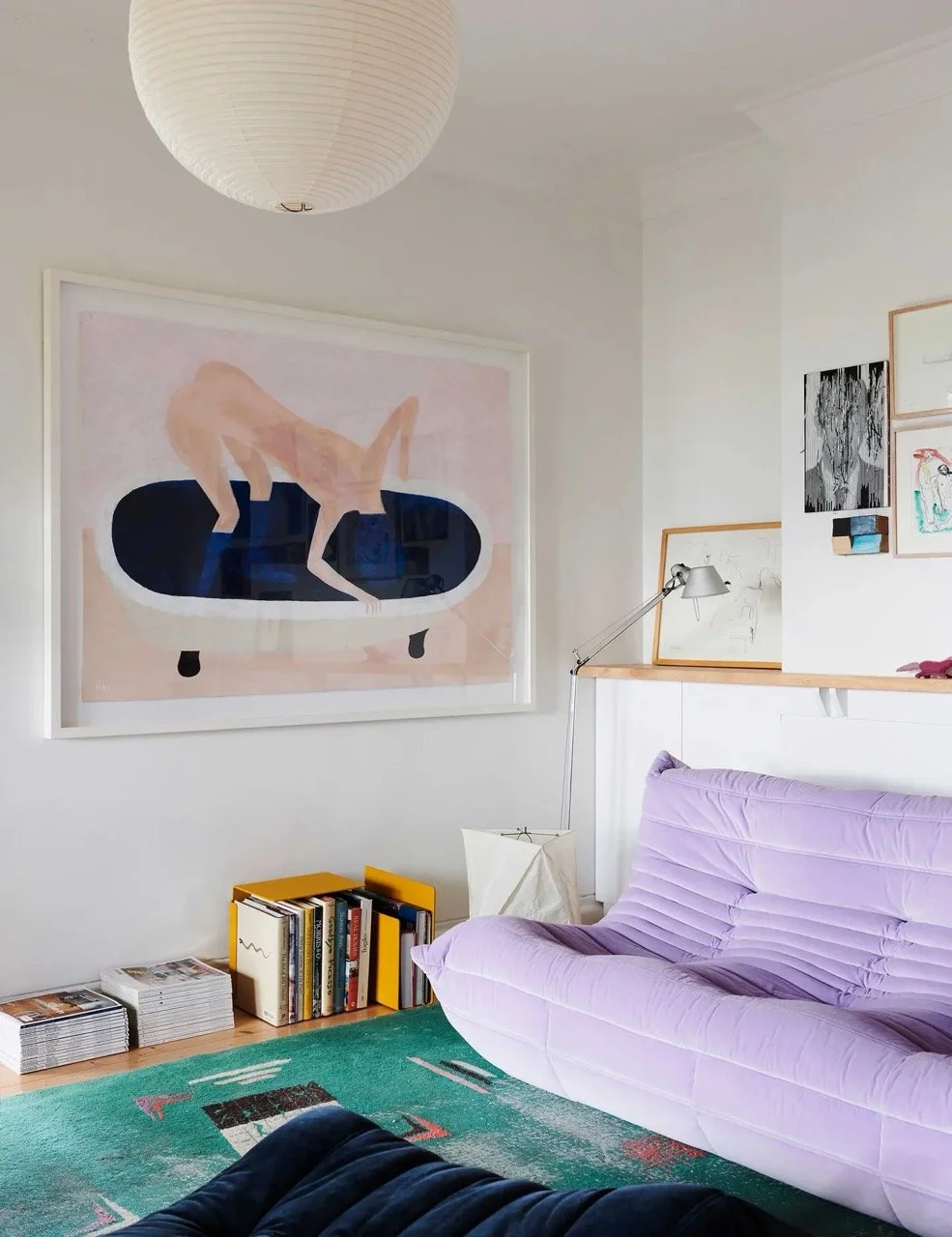
Lavender is a wonderfully soft and dreamy colour that makes you think of spring blossoms and scented candles. Something that may be traditionally seen as a colourful for kids’ rooms but when you pair it with navy blue, you’ve got a grounded, grown-up palette that still feels lighthearted and creative. If you’re looking for a soothing and relaxing palette, consider this one for your bedroom, living room, or dining room like the image above.
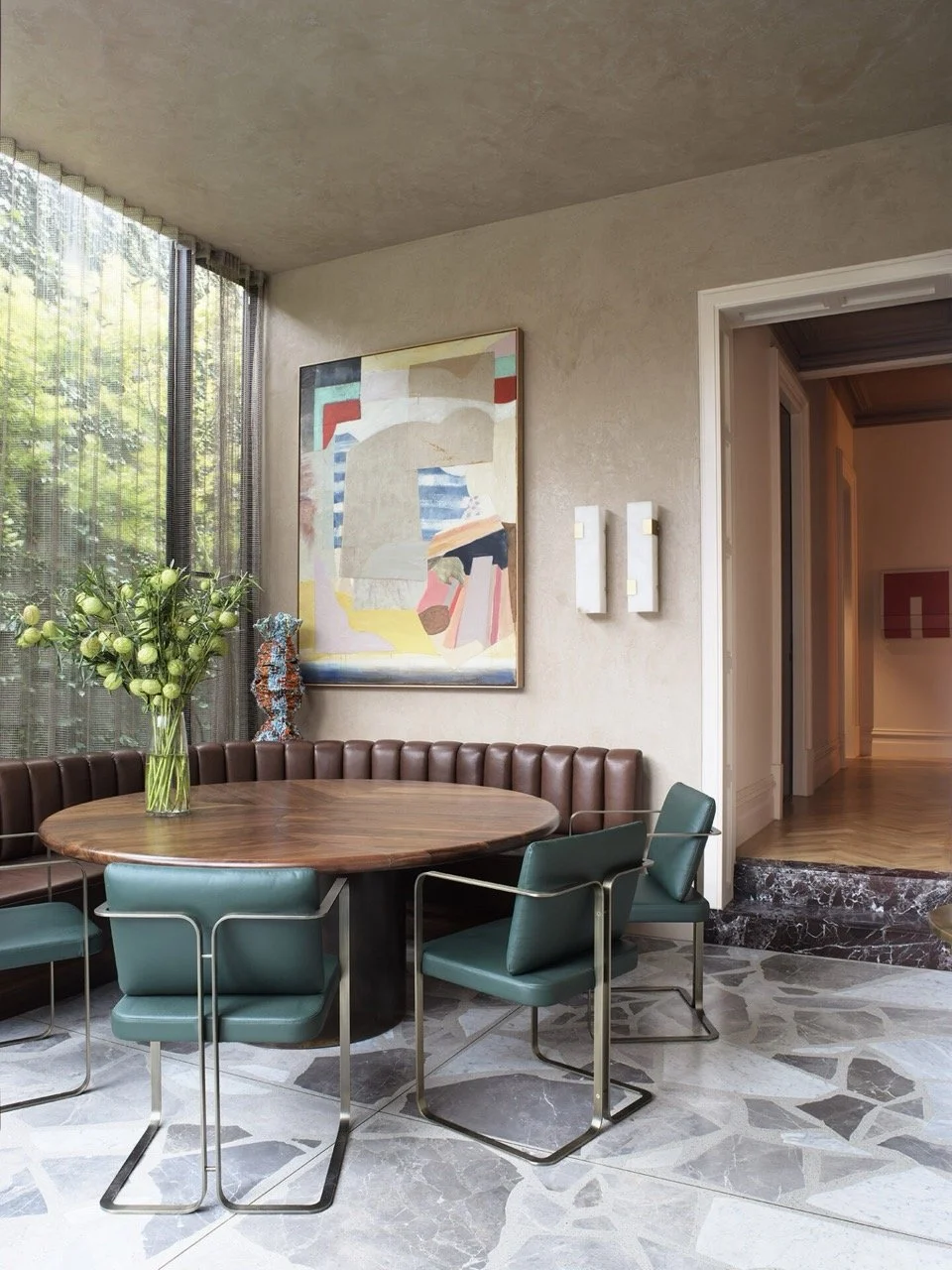
3. Tangerine & Teal
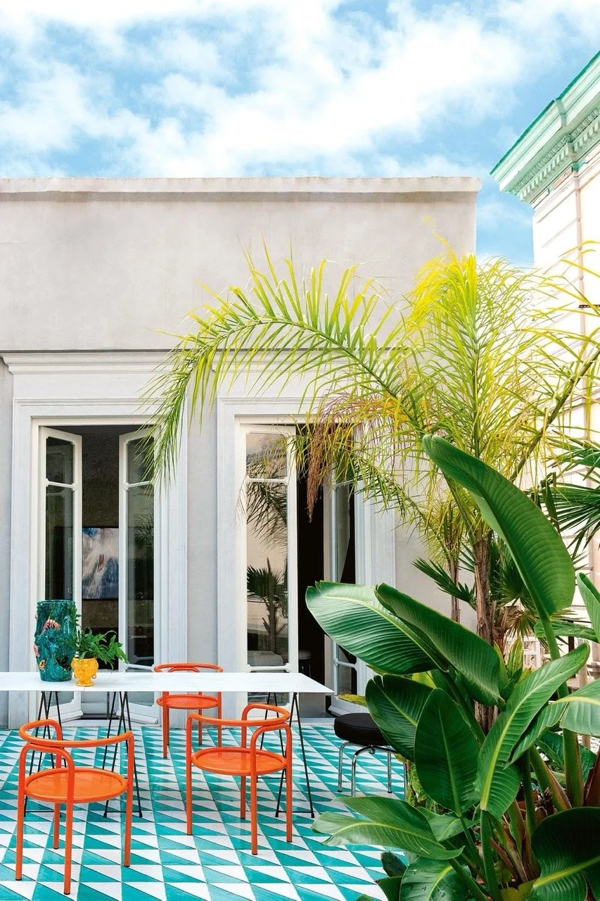
Tangerine and teal are the power couple of the colour world. Tangerine brings a vibrancy while teal is cool and chic and together they’re a match made in heaven! I love how they’ve done this colour combo in this alfresco dining area and bringing in the third colour green through the plants makes it all tie together so well. If you want something bold, loud and unapologetically fun, this may be exactly what you’re after!
4. Black & Primary Blue
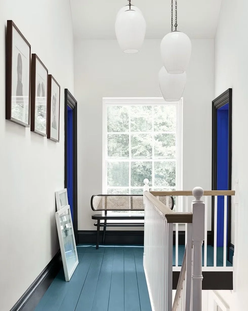
Black and primary blue is definitely not a colour combination that you see everyday but I love how they’ve used it in around the door frames and doors for some contrast and drama in this mainly white space. Black is sleek, modern and timeless, and the primary blue is so unexpected, adding a jolt of boldness.
The key here is balance. These heavy colours need the white so the room doesn’t feel enclosed. The blue also needs to be in small amounts so it can command your attention. If there was any more, it wouldn’t be that unexpected pop of colour and have that same effect.
5. Fuchsia, Yellow & Blue
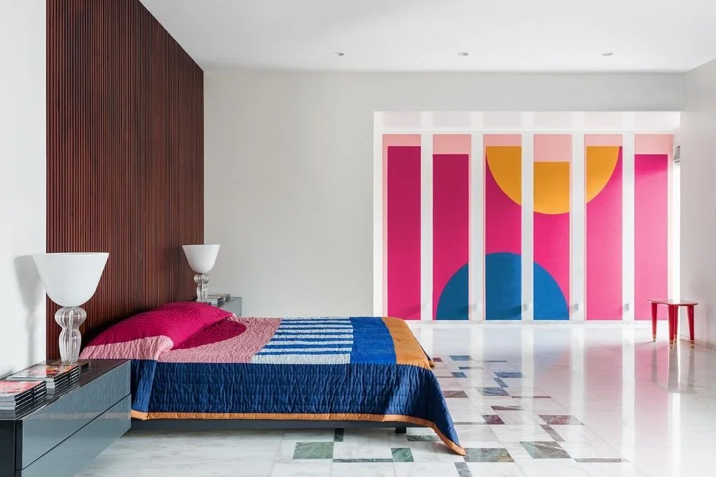
Now this one is definitely more on the wild side. Very bright, very bold and maybe a little bit crazy, but if you do this color combo in small amounts and balance it out with neutrals like in this bedroom, it can all come together very nicely.
This might not be to everyone’s taste for a bedroom, but it could definitely work well in an art studio or living room where you want vivid colours for fun and energy!
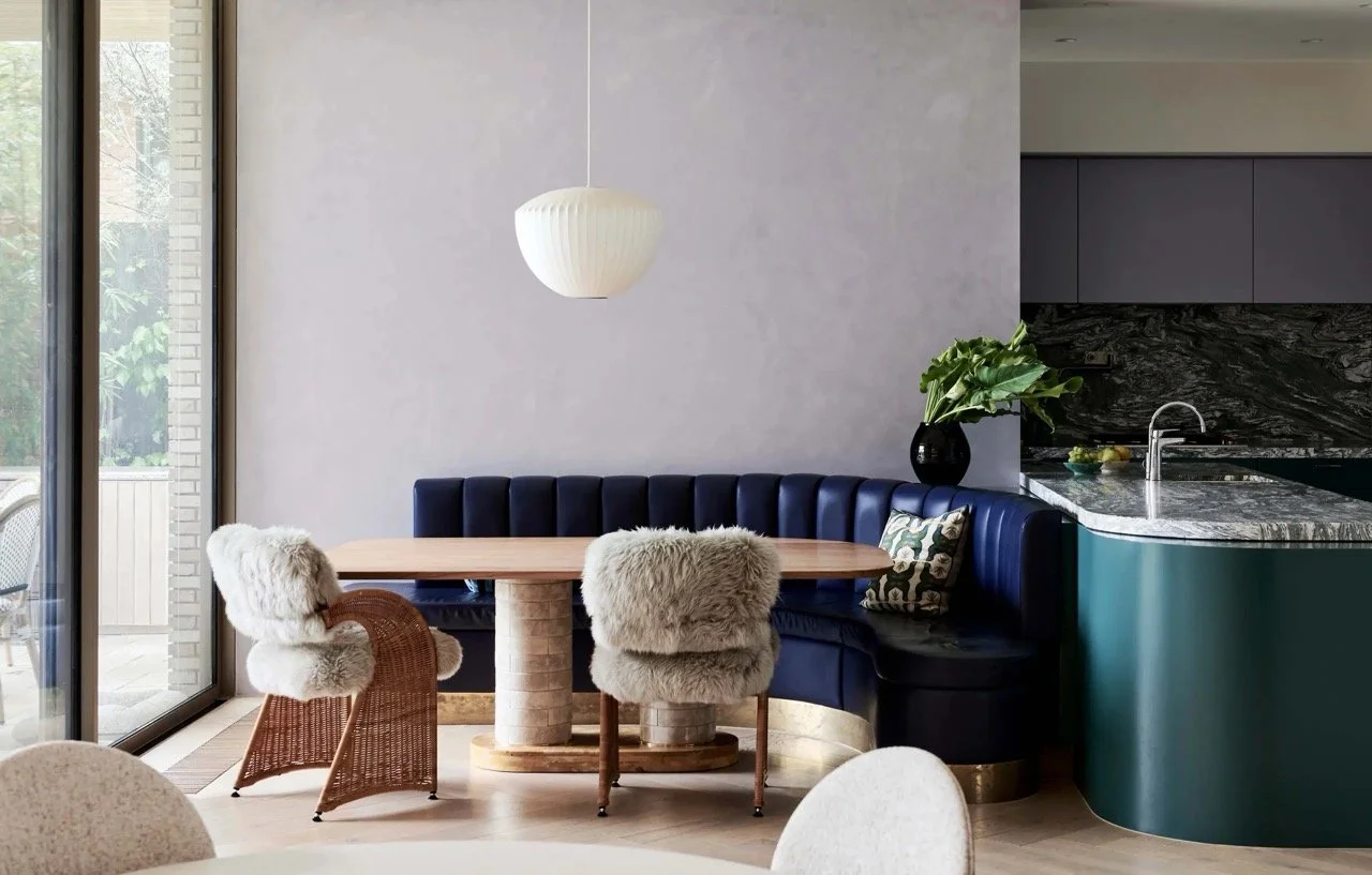
6. Brown & Teal
Brown doesn’t exactly always scream excitement but it’s a solid, classic colour that’s always there when you need it–something like a dependable older sibling. Teal, on the other hand, is like brown’s cool, artistic cousin. Together, they strike a perfect balance between natural warmth and modern flair. You could do it in a dining room like the image above or perhaps in a study with deep brown wooden furniture with teal cushions or chairs. A colour combination that’s more toned down, but still colour nevertheless.
7. Navy Blue & Maroon

Now this colour combo is probably the least unexpected of the lot but that doesn’t mean it’s not worth a mention. These colours work well together because they’re in the same tonal family with roughly the same amount of dark grey mixed into them.
These images are both great examples of how this combination can be used in kitchen and dining rooms but it definitely could also be used in bedrooms and living rooms. You’ve also probably noticed that both have white in these palettes on the countertops, chairs, cupboards, walls or doors. I’d keep this in mind if you want to replicate this scheme because it prevents the scheme from being overly dark and dingy.
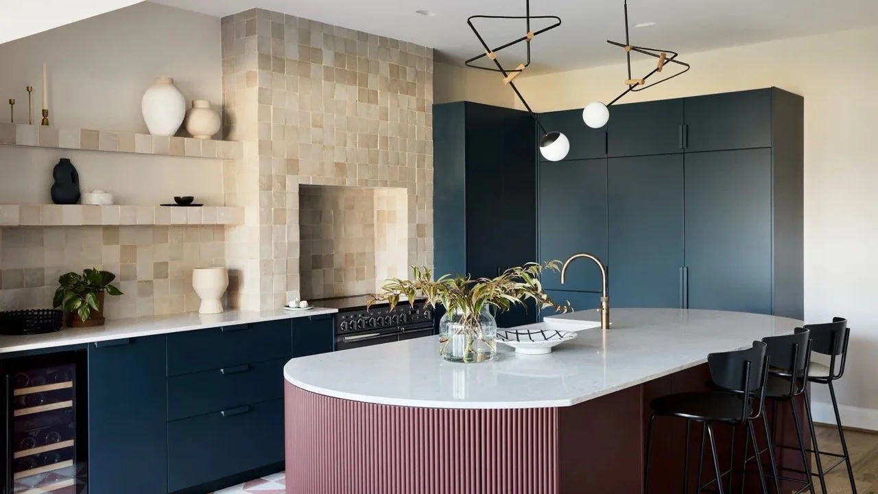
8. Orange & Black

Yes, I know what you’re thinking – Halloween. But trust me, orange and black is a colour combination that definitely can be used in interiors outside of the spooky season!
Orange can quickly become too much so I’d recommend doing a mainly black scheme with hints of orange like this matte black kitchen with orange accent dining chairs. The black will ground the room while the orange adds that element of fire and fun.
Pro Tip - Rooms that are predominantly black is very strong, so it requires plenty of natural and artificial light. Without enough light it’d feel like you’re living in a black hole.
Wrap Up
So there you have it–eight colour combinations that seem wild but totally work. Hopefully you’ve been inspired to use a bit more colour in your home!
I talk about color in much more depth, from how to choose a color palette, what color goes with what, and how color exists in relationships (so you can choose paint, furnishings, and decor that actually work together instead of looking completely off) in Chapter 2 of Practical Home Design.
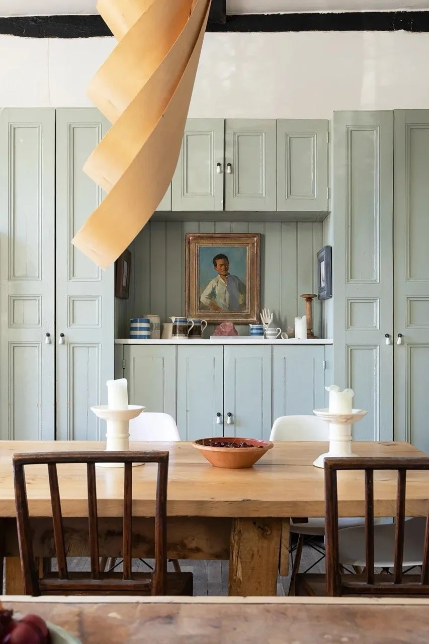
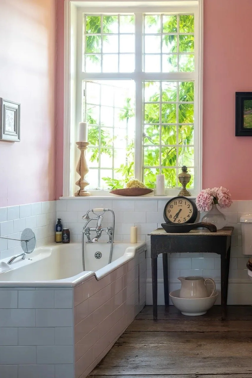
Beautiful Space
A 1600s British Home | Photography by Fiona Walker-Arnott, Written by Gabrielle Savoie
Struggling with decorating your home?
Check out some of our templates and resources.
Or check out my Practical Home Design course where I cover a step-by-step process so you, yourself can confidently make your own choices and design a home that you’ll love. There's roughly 3 hours of video content, and I'll also provide you with guides, handbooks, templates, and a bunch of resources to aid your learning.