The Curation: Timber Open Shelves, Guide on Wood Tones Mixing, and Beautiful Space
Transform your reading nook with our thoughtfully curated collection of timber open shelving this week. From sleek contemporary designs to timeless classics, priced at as low as $125, you might just have found the perfect match for your home! I'll also cover a highly requested topic - is it ok to mix wood tones?
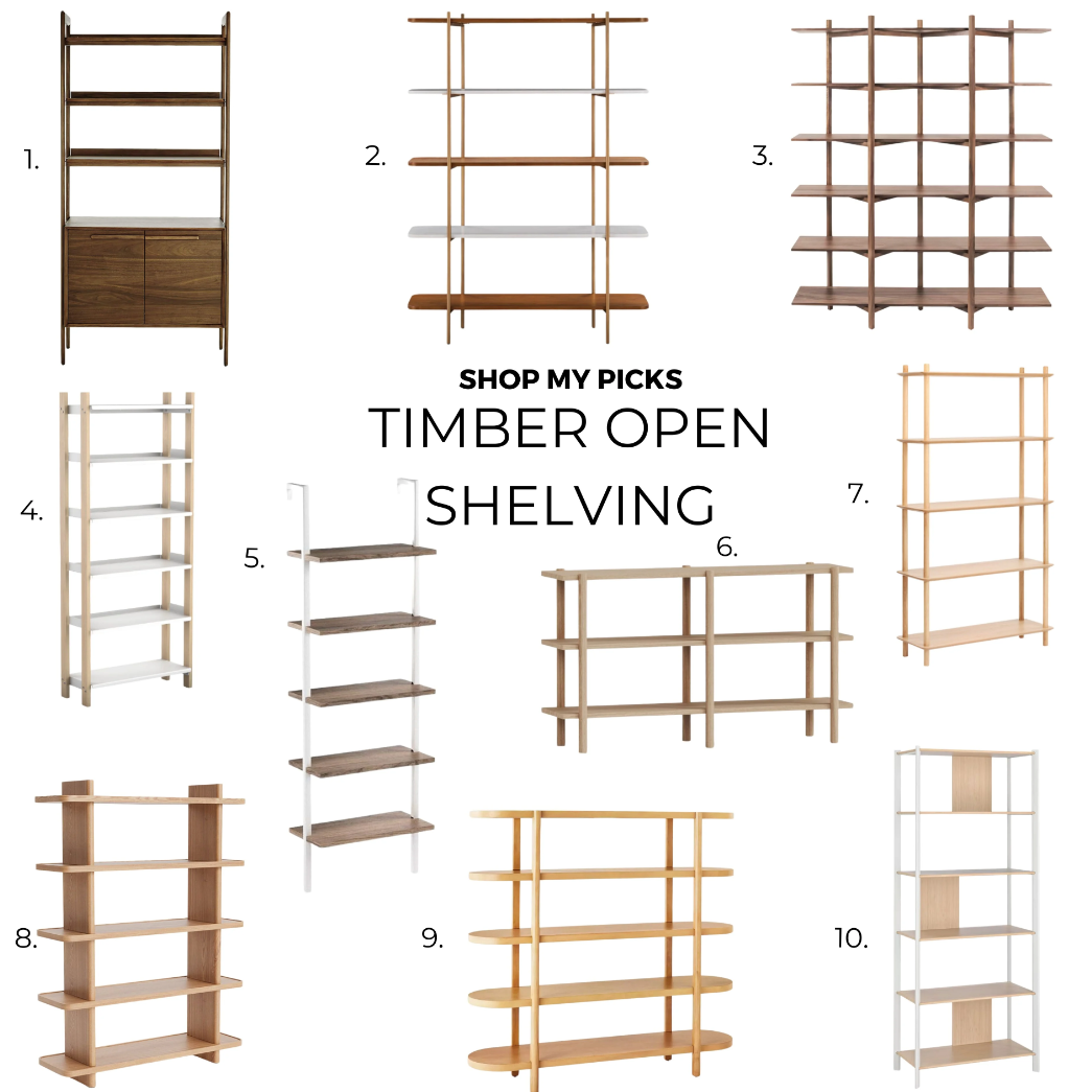
Tate Walnut Storage Bookshelf Cabinet, $999, Crate&Barrel
Zig Zag, from $1899, Hem
The Shelving System, from $540, FLOYD
Nathan James Theo Wood Modern Bookcase, $125, Amazon
Banjo 5 Tier Bookcase, A$349, Temple&Webster (AU)
Kirribilli Bookshelf, from A$895, Kóala (AU)
Portola Hills Horizontal Bookcase, $400, Target
JÄTTESTA, $199, IKEA
Weekly Learnings & Findings
Is it ok to mix Wood tones?
I got a few questions on my YouTube comments asking if it’s ok to mix different wood tones, and the answer is "Absolutely, yes!"

In fact, it’s better if you have some variety of wood tones in your home, rather than everything matching perfectly.
Ray Staples, a pioneer in the interior design field, once made a poignant remark about the use of wood tones in design. When she was asked about her views on mixing different wood tones, she replied, “Do all trees in a forest match? No!”
But, how do you mix wood and make sure it flows together nicely? Here’s a breakdown to make it easy for you.
1. Identify Your Dominant Wood Tone
Kick things off by figuring out your dominant wood undertone. This could be your floors or a main piece of furniture in your room.
Broadly speaking, you can categorize wood into warm and cold undertones, but I think some can fall under a neutral category or somewhere in between. Anything with a red, orange, or yellow undertone is warm. This includes most unstained woods used in antique pieces like teak, cherry, mahogany, and hickory. Cool undertones are usually stained wood with charcoal, bark, or sand stains. Things like white ash or driftwood also tend to have a little blue, grey, or even green in them. Neutral is what I’d categorize as timbers that are somewhat in the middle. They have no grey or yellow cast, like walnut, oak, and maple - these tend to be the most enduring and balanced.
Note: Most natural woods are warm/neutral, but with the grey trend of the last decade, there are a whole lot more cool wood tones out there.
2. Match the Undertones
Wood within the same undertone will naturally mix well together in a space. But, you should not try to mix cool and warm wood in a single space. There are of course exceptions to this rule, but it’s much easier to start that way. Neutrals are much more versatile, and you can usually combine them with warm or cool tones.
So, if you have warm woods, stick with warm tones for your other pieces. And, if you have cooler tones, stay in the cool zone. This will help keep your room feeling cohesive.
3. Play with Light and Dark
When it comes to mixing different wood, my best advice is to go for contrast. Create some visual excitement by using a mix of light, medium, and dark woods. For example, if you have a light oak floor, darker stained wood like walnut will create a nice contrast. Don’t try to match the wood tones, but match the undertones instead. You want them to be from the same family to create continuity.
4. Spread them out
As with most things, repetition is key. You need to balance the wood tones in various places throughout the room, so once you introduce a tone, evenly disperse it throughout the room to create a more intentional look. You don’t want one wood tone to stick out like a sore thumb, so make sure every tone has a double, and scatter them throughout the room.
5. Create Buffer
If you find that your wood tones are very similar to one another, it may be a good idea to use a buffer. For example, if you have a dining table and floor with very similar tones, it can look like an endless sea of brown. A rug between them will help break it up and add a nice visual separation, instead of having the dining table wash out and disappear - or worse, look like you’re trying to match them but miss the mark. That’s why when you see a desk and wall shelf with the same wood, they usually look really nice together as the walls add a visual separation between them.

Notice how the rug here helps separate the dining table and floors | Azabu Residence by Norm Architects & Keiji Ashizawa

Here, the table and floor have enough contrast | Central District by Brian Paquette Interiors
In short, mixing wood tones is not just possible but highly encouraged!
Beautiful Space
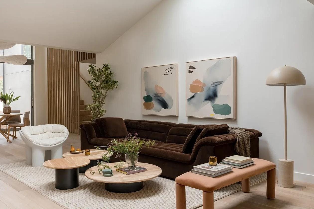
Open Concept Encinitas Family Home | Written by Lydia Geisel, Photography by Charlotte Lea, Styling by Abbie Naber and California Casa

Struggling with decorating your home?
Check out my Practical Home Design course where I cover a step-by-step process so you, yourself, can confidently make your own choices and design a home that you’ll love. I'll also provide you with guides, handbooks, templates, and a bunch of resources to aid your learning.
See you in a fortnight!
Reynard Lowell