The Curation: Throws, Ways to Elevate Your Living Room, and Beautiful Space

La Calle Alpaca Throw, $159, THE CITIZENRY
Mira Linen Throw, $275, CULTIVER
Emme Cotton Throw, $30, Amazon
Checkered Reversible Wool Throw, $198, LULU&GEORGIA
Modern Check Lambswool Throw Blanket, $178, Brooklinen
Framed Jacquard Knit Throw Blanket, $25, Target
Solano Cotton Throw, AU$150, Temple&Webster (AU)
The Loomia Sophie Throw, $69, Amazon
Big Swell Throw, $57, Koala (AU)
Weekly Learnings & Findings
How To Elevate Living Room - 4 Do’s & 4 Don’ts
Dos: Incorporate Repetition and Contrast
If you’ve been to a living room that is fully furnished, yet feels flat and quite lackluster, oftentimes is due to the lack of contrast.
The explosion of flat-pack furniture does contribute heavily to this, as many rooms are filled with only square or angular furniture, and all the elements in the room are either MDF, polyester, or plastic, making things look flat and boring. Instead, you need to introduce different textures and materials, shapes, tones, and scales for depth and richness.
Think about how you can contrast various elements like:
hard & soft
straight & curved
dark & light
matte & glossy
warm & cold
For example, you often see designers place a rough terracotta vase on a smooth marble countertop.
Similarly with colors, if you decide to go neutral or monochrome, try to incorporate different shades of them. A lot of people make the mistake of choosing the exact same shade of color, which will end up looking very one-dimensional.
Dos: Add Greeneries
Always try to add some plants to your living room. Be it an indoor plant (best), faux greeneries, a flower bouquet, a simple branch arrangement, or better, a combination of a few of them.
Plants are very popular in the design world because they have an organic shape, add a variation of color, bring nature in which is always a nice bonus, and add texture. It ticks all the boxes and is often very affordable.
This will help infuse some life into your room and the variety in shapes makes for a more visually interesting room.
Dos: Multiple Light Sources
If you’ve watched some of my past videos, you’ll know that I always put a huge emphasis on lighting. One source of lighting alone is not enough, especially if it is only ceiling lights. Try to mix and layer different types of lighting such as accent, task, and ambient lighting.
This may seem confusing but if you break it down, it simply means having a combination of ceiling, table, and floor lights and where possible, a few decorative lights that illuminate things like architectural details or artworks.
If you have enough space, try to include both floor and table lamps. The variation in height will make your room look much more interesting and having multiple lamps will balance the light throughout your room.
Also pay attention to direct and diffused light, in general, light sources that are diffused will reduce harsh shadows, this has a similar effect to a cloud going in front of the sun. When choosing a lamp or light, think about the function first and foremost. A lamp with a directed beam is best for a reading nook, but a standard lamp with a shade may be better if you want to illuminate a dark corner.
Having multiple light sources also allows you to turn off that harsh ceiling light at night so you can enjoy a more relaxing atmosphere.
Dos: Enough walking space
A common mistake I often see is not having enough space between large furniture pieces. If everything is jammed up together it’s usually not going to feel comfortable, or if you have to squeeze in between chairs it’s also not going to be comfortable.
The solution is to simply have enough space between large furniture pieces so people can easily get around. A general guideline is to give 75 to 90cm (30-36”) of walkway between large pieces if your living room allows for it, or at least 50 to 60cm (20-24”) of space for smaller spaces. Note that this is different from the seating area (i.e. sofa to coffee table, or armchair to armchair), where you want it to be closer for a more intimate setting).
Remember that you’re building a room for people to live in, so the number one goal is to design a space that you or your guest can comfortably be in.
Another reason why you’d want to have enough space is that things tend to look cluttered when there is not enough breathing room. If your furniture is too big, or if you have too much furniture that there is not enough walking space, it’s going to look heavy and suffocating and not comfortable or inviting.
Don’ts: Matching Furniture from big-box store
When you go to a big box store and pick out everything from the same exact line and bring them home, you’ll just be bringing that ‘showroom’ look home and it generally won’t feel personal or inviting.
While it does look cohesive, it’s going to look boring and lacking personality. It won’t feel like your home and not something most of us want after spending thousands of dollars on pieces of furniture.
Instead, mix and match new and vintage pieces, and furniture of different styles, experiment with interesting shapes and colors, and inject personal touches like books and photos for a more inviting space. This approach not only breaks away from the cookie-cutter feel but also creates a more unique and welcoming environment that resonates with your personal style and experiences. If you’re unsure where to shop outside of the big retailers, then be sure to check out our mega shopping list, where we’ve compiled 300+ stores, many of which are local makers, boutique stores, and places where top designers around the world source for their own projects. You'll get an insider’s view into the world of home furnishings.
When it comes to mixing furniture pieces, the key is to look for common threads like material, style, or color. A contemporary dining table mixed with vintage chairs is likely to go together if they are made of the same kind of wood.
Don’ts: Rugs that are too small
While huge rugs are often way more expensive, having a rug that is too small can actually do more damage than good. It looks extremely awkward and makes the room feel disjointed.
Generally, you’d want a rug in a living room to ground the whole seating around it. This can be done in two ways, either by having the front two legs of the sofa and armchair on the rug or by having all furniture legs on the rug.
The first option will generally cost less and is often the more popular choice for most of us who live in apartments or smaller spaces. Another go-to rule is to have your rug at least 15cm (6”) wider than your sofa on both sides.
If you have a big and grand living room, the latter will create a more dramatic look so make sure to take out your tape measure before making a purchase.
Don’ts: TV or Artwork that is too high
Avoid hanging TV or artwork too high up, you don’t want to be looking up every time you sit or walk. It also creates an awkward gap on the wall that looks disjointed.
Generally, artwork should be hung at ‘eye level’ roughly 150cm (57-60”) from the center of the artwork to the floor. This is the standard used by most museums worldwide.
If you’re hanging your art above an item of furniture, it can be roughly 15-25cm (6-10”) above the piece so they are connected and not floating on their own.
There are exceptions to this rule, say if you’re a really tall person then consider going slightly higher, or if your ceilings are really low, you can consider going lower to help engage the whole space.
The goal here is to have the artwork and piece of furniture relate to each other, and that they’re close enough to each other so together they’ll engage the whole wall together as a unit.
The same thing with a TV, you don’t want it to be too far up that you have to tilt upwards when watching your TV. As you can imagine, it’s not only uncomfortable but placing them way above eye level can disrupt a room’s visual harmony, as it draws attention away from other design elements.
Don’ts: Too Small Artwork
Another thing you should avoid is having an artwork that is too small for the space. This tends to cheapens the look of the space, and create that big blank space that your eyes keep gravitating towards. If you are hanging art above a sofa or console, try to aim for 1/2 to 2/3 of the width of the furniture. If cost is not a problem, a slightly bigger art is always better than when it is too small. So if you have to choose, it’s safe to go bigger.
What about a gallery wall or multiple art pieces? Then you should treat the whole collection as one piece, and plan them accordingly as if it were one. This means the center of the grouping is the center of the artwork as if it were one piece.
Space them about 5cm (2") apart so they look together and not disconnected. You can trace them with painter's tape on the wall before installing them, or play around with the configuration with the size in mind from your computer.
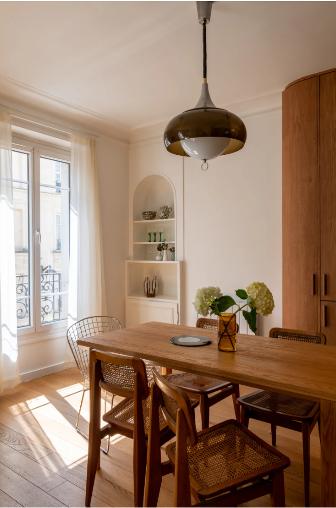
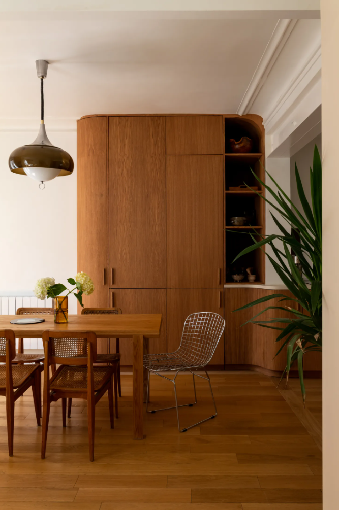
Beautiful Space
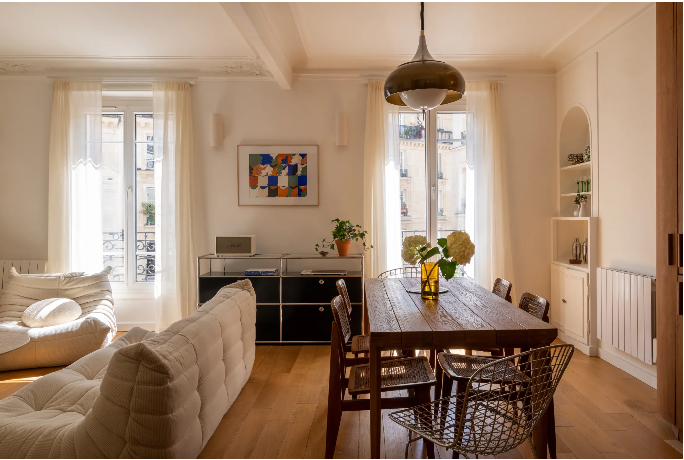
Panama Apartment, Paris | Images by NeverTooSmall & Agathe Tissier-Dumont
Struggling with decorating your home?
Check out my Practical Home Design course where I cover a step-by-step process so you, yourself, can confidently make your own choices and design a home that you’ll love. I'll also provide you with guides, handbooks, templates, and a bunch of resources to aid your learning.
See you in a fortnight!
Reynard Lowell