How To Incorporate A Pop of Colour Into A Neutral Room
Today we’re exploring a simple yet effective way to refresh a space: adding a pop of colour to a neutral room.
The Power of One Bold Colour
I do love a neutral room but unless you’re super talented at weaving textural elements into these spaces, they often fall flat. Now, I’m not saying that you can’t pull off a monochromatic room but adding in one pop of color is a super easy way to draw the eyes in and create a focal point.
There are endless colors that go well with neutrals but some of my favorites are:
Forest Green
Terracotta
Sage Green
Blush Pink
Golden Yellow
Dusty Blue
Remember that every color tells a different story and will affect how you perceive a room and also how you feel in it. For example, yellows and reds are quite energizing so they may be better suited to living areas. Blues and greens are calming and great for bedrooms.
If you’re not sure how to develop a color palette for your own home, this video will be super helpful: Guide To Use Colour In Your Home – Choosing Colour Palettes + Pairings That Work
Now before we dive into ways to introduce color, there are two very important things to remember: Repetition and Variety.
As you go through the images, notice how for every statement piece with color, the same color is going to be repeated elsewhere in the room at least once.
Then, within those repetitions, there is some sort of variety. Be it medium (different objects), or different shades of the same color.
This is key to making that pop of color work. You can check out the video below if you want to dive deeper into this.
Easy Ways to Introduce Colour
1. Statement Furniture
If you’re looking to do something other than the usual addition of a colorful vase, consider adding a piece of colorful furniture. This could be anything from an armchair to an ottoman or a bench, or if you’re feeling really bold you could even get a whole new sofa.
Notice how they have added colorful statement pieces in both of these rooms – the blue ottoman and the red dining chair!


2. Throw Pillows & Blankets
This is the most basic way to add in colour but it definitely works. What I love about throw pillows and blankets is that you can swap them out seasonally for an easy color refresh!
Pro Tip: If you’re unsure about committing to a bold hue, try a muted version – think sage instead of emerald or peach instead of bright orange!


3. Rugs
Another idea is to get a colorful rug to anchor your room. But if that’s too bold, you could get a rug with a little bit of color or a patterned border.
I love how they’ve made this room feel so bright and colorful with the rug (and the framed mirror). You hardly notice how plain all the other furniture is!

Photography by Rohan Thomson
4. Decorative Accents
If you want subtle touches of color, decorative accents are the way to go. This could be anything from a vase to a ceramic bowl to a book.
Notice how they’ve added the bold blue artwork in this living room and repeated this bold moment with the mesh fruit bowl on the coffee table – a great way to make it all feel cohesive.
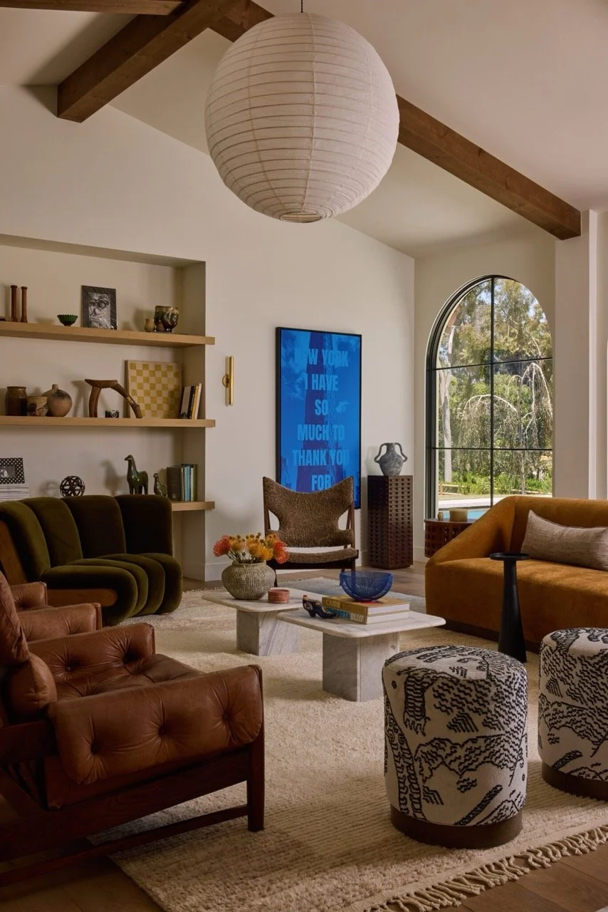
Rever Design Co.
If you’re after more decorating tips for a neutral room, you may be interested in this video: How To Decorate A Stunning Neutral Room & Why Neutral Is Not Always Timeless
5. Painted Accents
Painting your walls is a great way to incorporate color, but you don’t need to paint them all or do a traditional accent wall. Consider adding in some unexpected pops of color by painting the underside of an arch or a doorway or a built-in niche or wall nook.

Photo by BCDF Studio
Keeping It Balanced
You don’t want your pop of color overpowering your timeless, neutral scheme. Here’s how you can make sure it feels cohesive.
1. Repetition Is Key
Repetition is the secret to a cohesive and balanced design which is why you have to repeat your pop of colour multiple times. As a rule of thumb, I’d suggest repeating it in three places. This may be on a pillow, in an artwork, and on a vase but it can also be on anything and anywhere.
Also remember that it doesn’t have to be a repeat of strictly the same hue (In fact, I recommend varying them where possible). You may have a few green elements that are all slightly different shades rather than all the exact same forest green.
2. The 80/20 Rule
While repetition is key, you don’t want to go overboard so that your pop of color turns into the main feature of the space. Try to stick to the 80/20 rule. This is where you have at least 80% of your space in a neutral tone and the remaining 20% in your chosen color.
3. Match The Undertones
Consider the tones of your neutrals when choosing your pop of color. Warm neutrals like beiges and creams pair beautifully with warm accent colors like mustard and terracotta. On the other hand, cool neutrals like whites and greys look fantastic paired with cooler tones like greens and blues.
But then again, you can get every color in warmer and cooler undertones. So while you may traditionally think that blue is a cool color, remember that you can also get a warmer shade of blue.
Struggling with decorating your home?
Check out some of our templates and resources.
Or check out my Practical Home Design course where I cover a step-by-step process so you, yourself can confidently make your own choices and design a home that you’ll love. There's roughly 3 hours of video content, and I'll also provide you with guides, handbooks, templates, and a bunch of resources to aid your learning.