The 3 Colour Combo Designers Use When White Feels Boring
I get it. White walls feel safe. Beige feels responsible.
But here's the thing…
I've lost count of how many clients have said some version of: "I want my home to feel more interesting, but I'm scared of ruining it with colour."
And I always tell them the same thing:
You're not scared of colour. You're scared of the wrong colour.
Big difference.
Because the rooms feel boring? They're not missing colour. They're missing intentional colour.
Not loud. Not a 2012 feature wall you'll regret in six months.
Just… considered.
Here are three colour approaches I keep coming back to — for clients, for my own spaces, for anyone who's sick of playing it safe but doesn't want to live inside a paint swatch gone wrong.
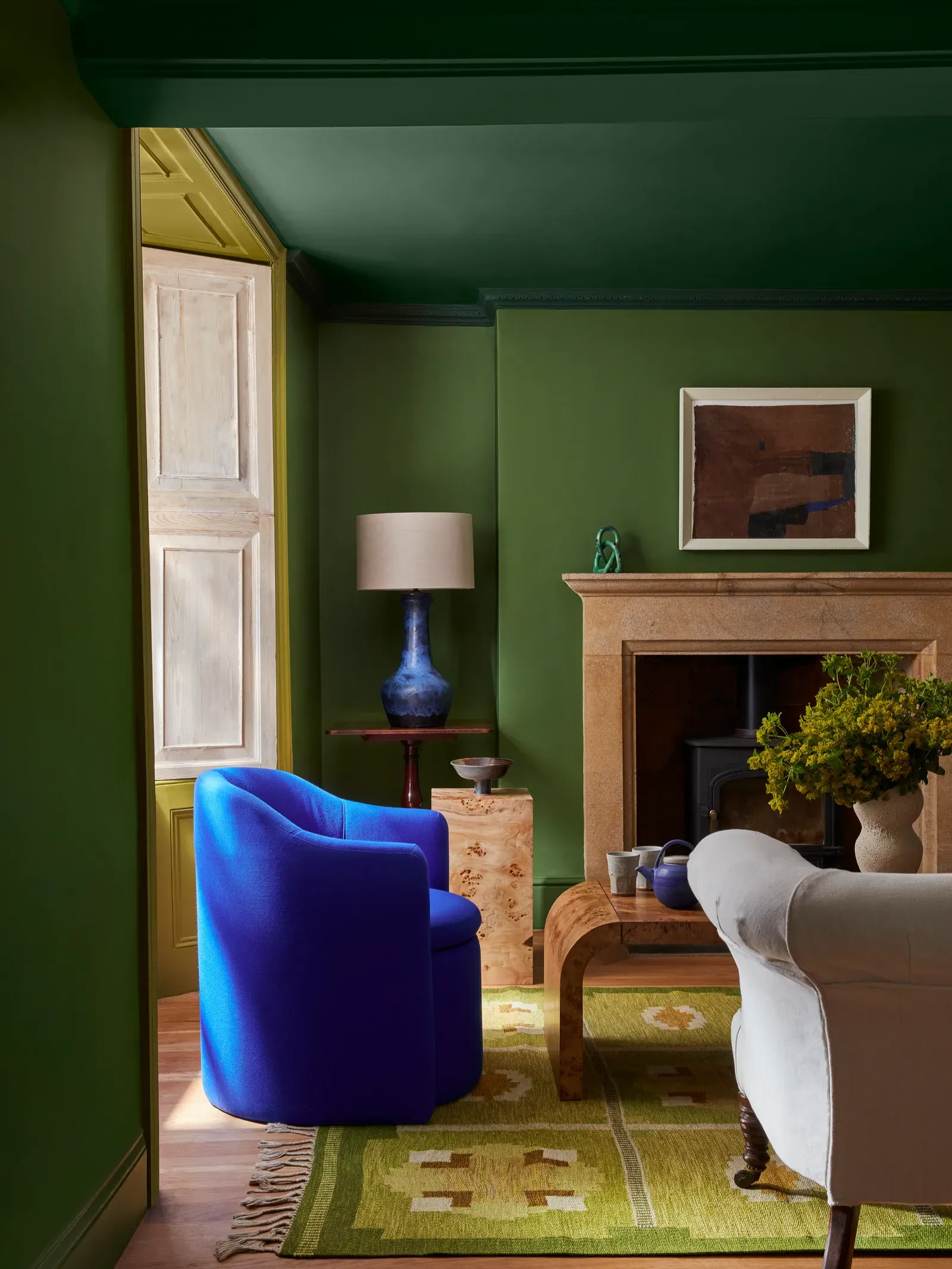
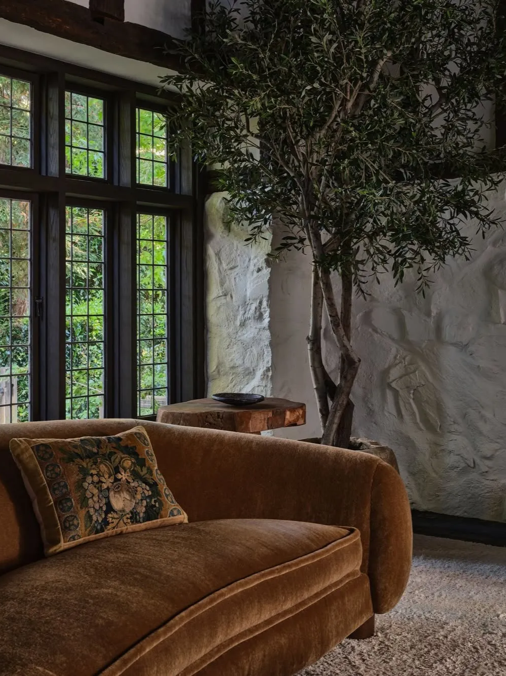
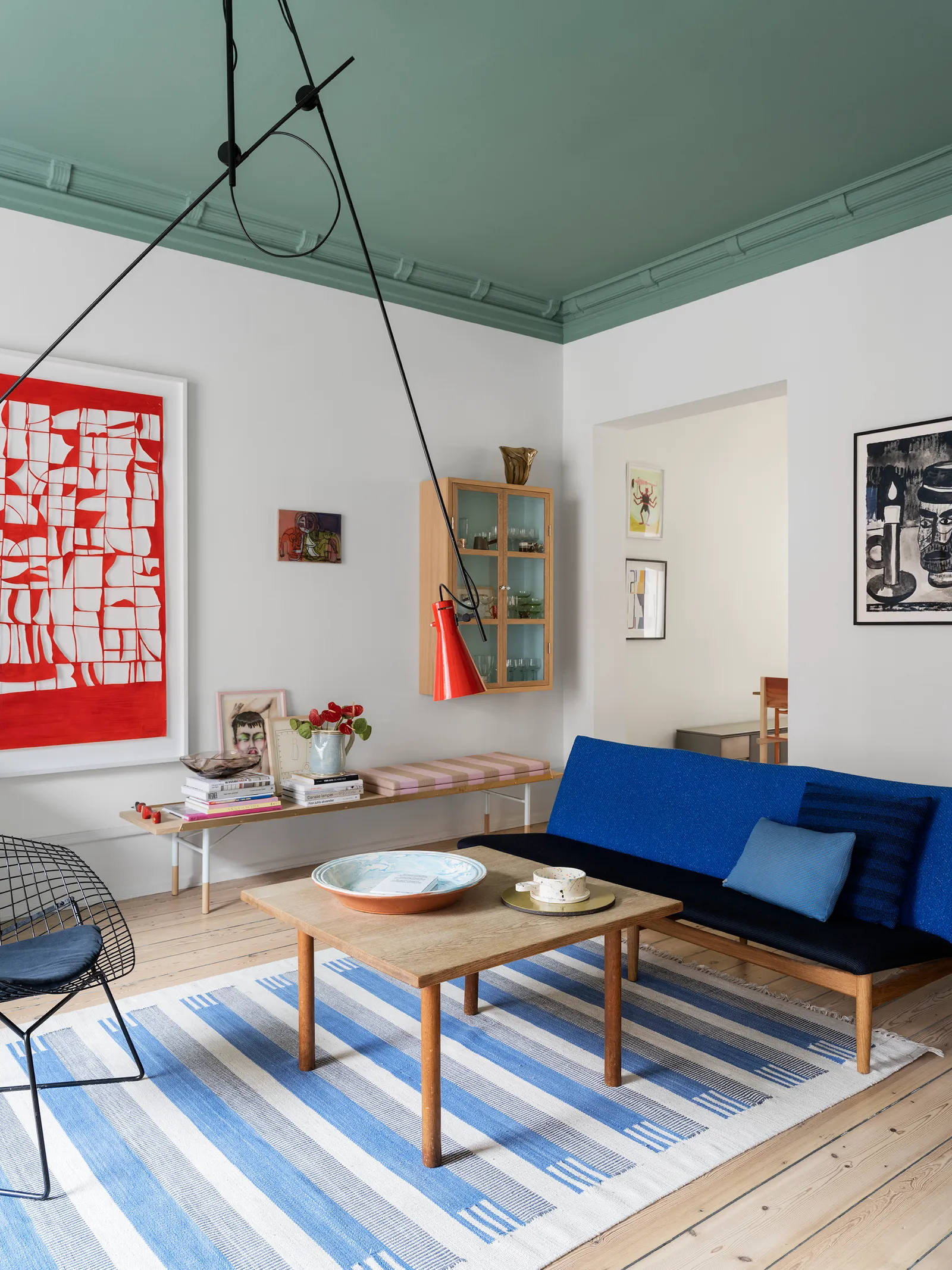
1. Tonal Layering (The Designer's Secret Weapon)
This is one of the most underrated techniques in interiors.
Tonal layering means picking one colour family and using it at different strengths, finishes, and undertones throughout the room.
For example:
Smoky green walls
Deeper sage on trims and doors
A muddy olive sofa
Soft moss cushions
Little Greene (left) & Astrid Templier (right)
See how everything in these tonal rooms is in the same green family, but nothing is identical.
Why this works:
It feels cohesive without being boring
It adds depth
It looks intentional (even if you’re winging it)
The mistake people make is choosing colours that are too similar. That looks bad.
You always want contrast within a family, like light vs dark, matte vs satin, warm vs cool undertones.
Michael Sinclair
And yes, you can do this with neutrals too. Think chalky whites and warm ivories instead of one bright white shade everywhere.
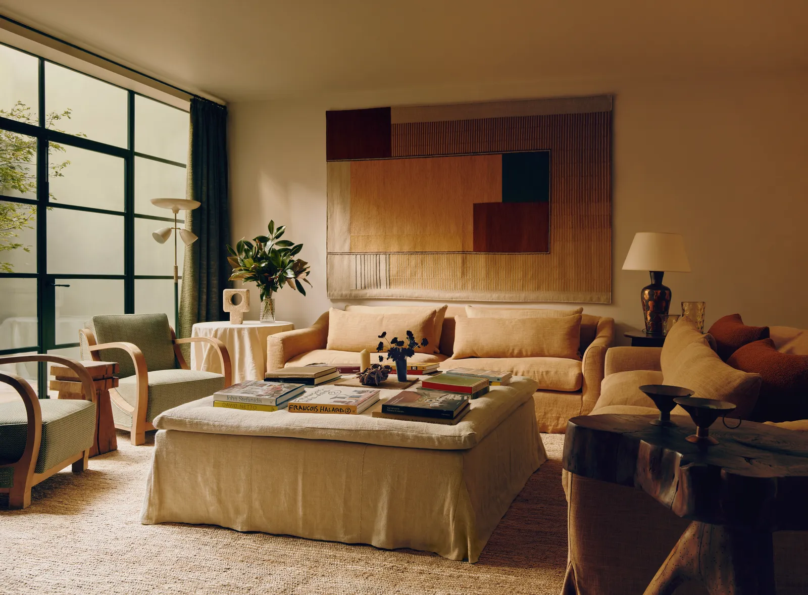
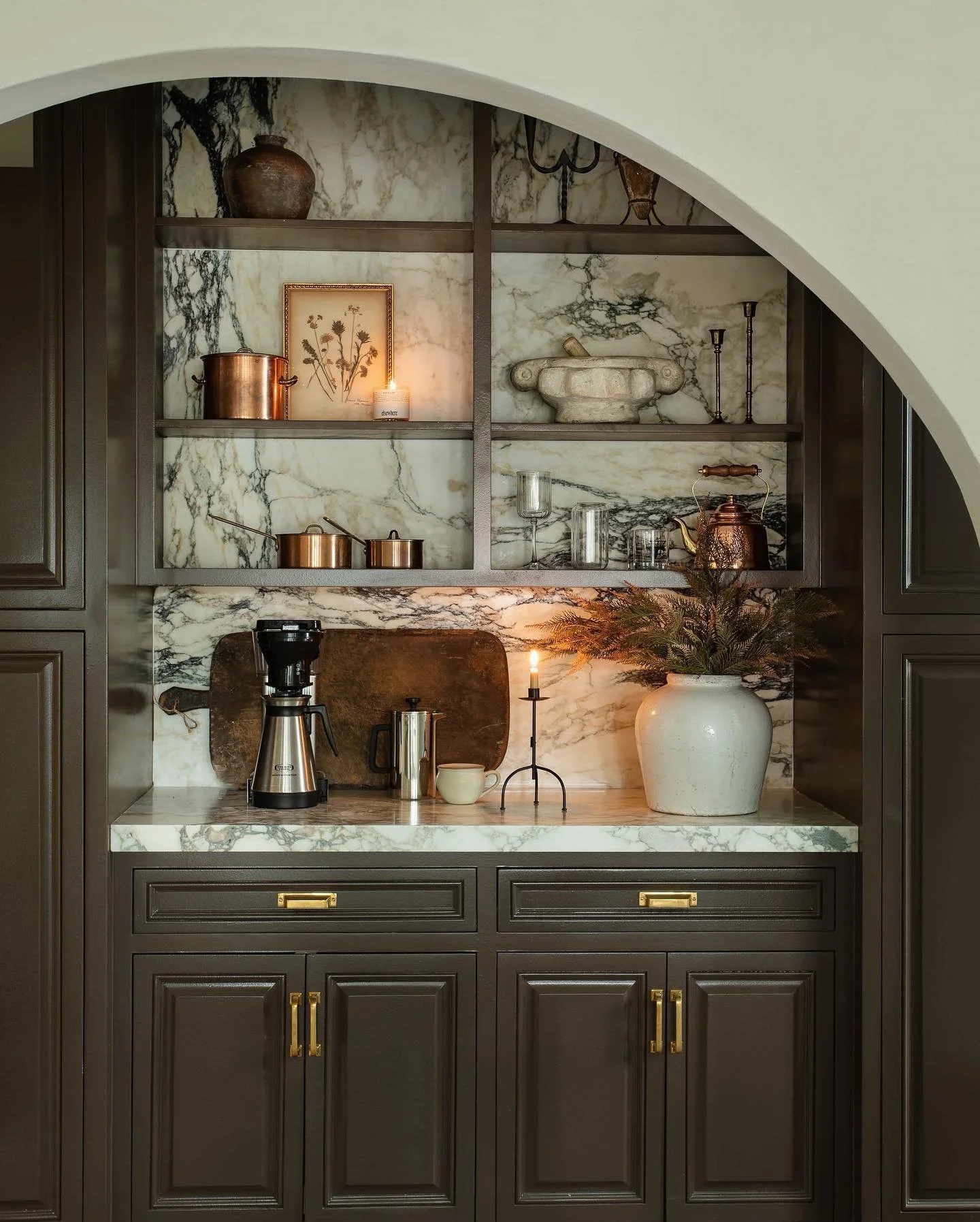
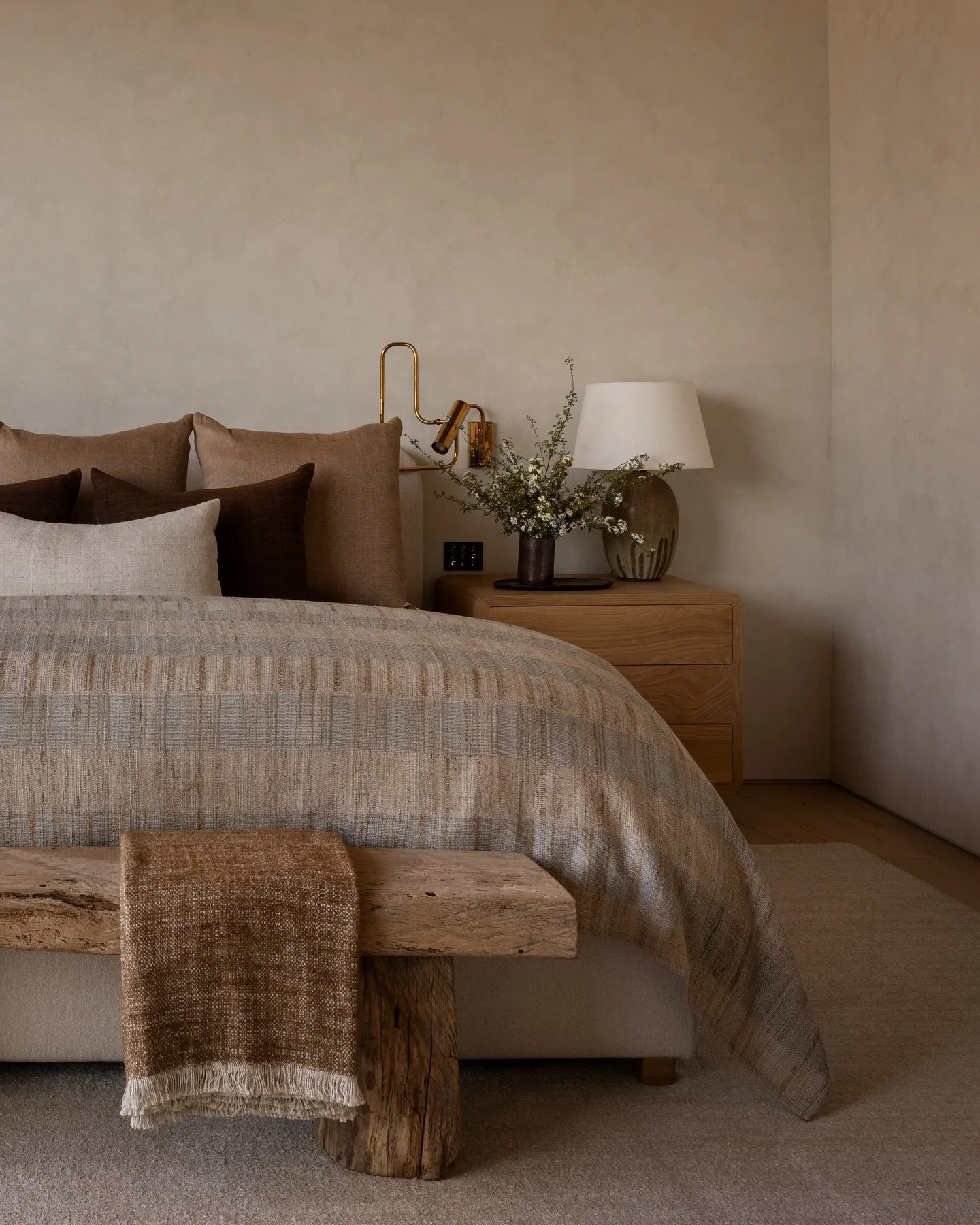
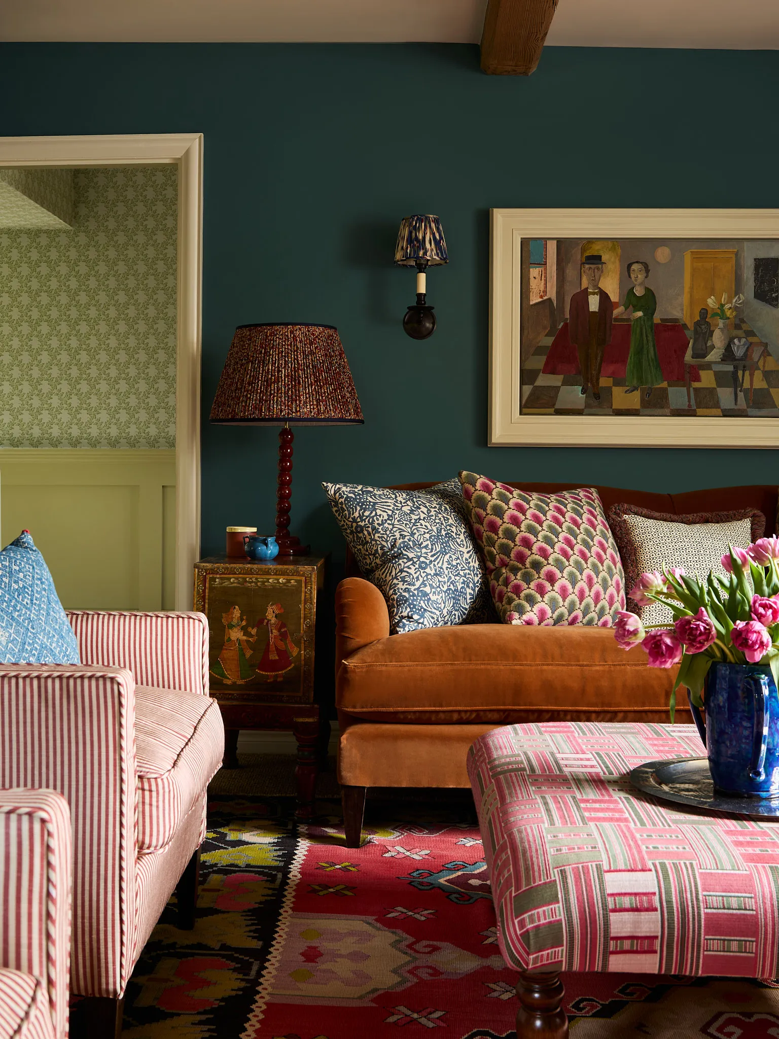
2. Brown (But Make It Good)
Brown is officially back.
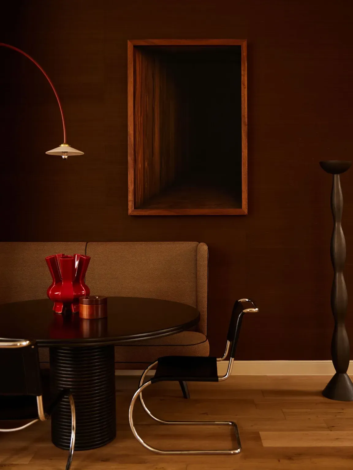

Photo by Danielle Siobhan (left) & Photo by Lillie Thompson (right)
But I need to be blunt here: there's good brown, and there's bad brown.
Good brown is rich and complex. It has depth. It feels like something you'd find in nature — because that's where it belongs.
Bad brown is flat, one-dimensional, and usually shows up on fake materials or in unflattering shades that make everything look dated.
Brown shines when it shows up in natural textures:
Linen
Timber
Leather
Wool
Velvet
That’s where it gets its depth.
Lone Fox Home (left) & Amber Interiors (right)
Some combinations that never let me down:
Brown + cream (classic, warm)
Brown + Blue:
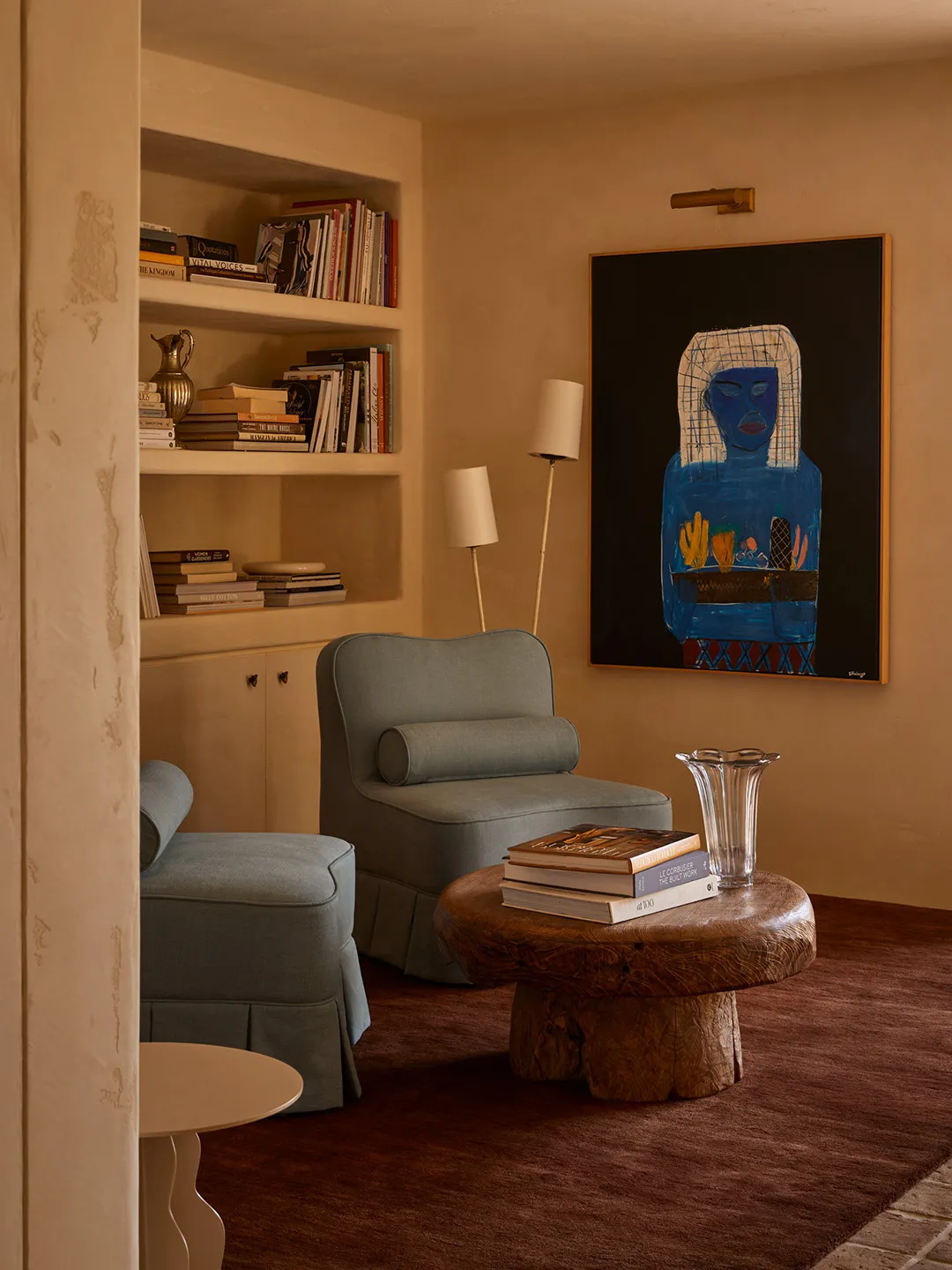
Photo by Lillie Thompson
Brown + Yellow:
Karen Knox
Brown + Green:
Jake Arnold
If you want your space to feel grown-up, brown is your answer. Just be picky about where it shows up and what it's made of.
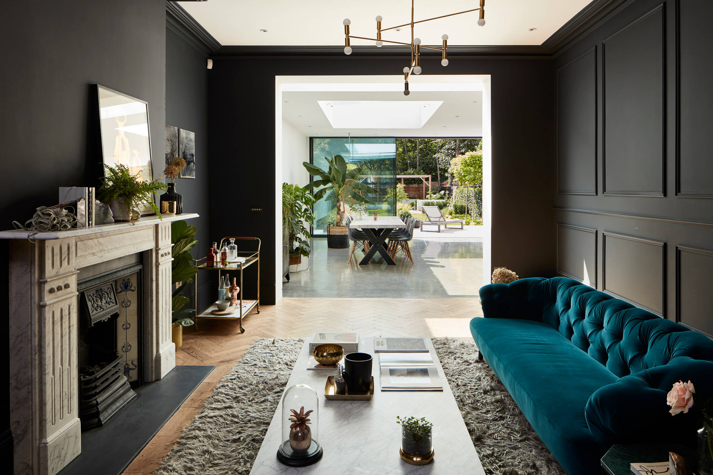
3. Teal (The Overachiever)
If colours had personalities, teal would be the overachiever who's annoyingly good at everything.
Brandon Schubert (left) & Line T Klein (right)
It sits between blue and green, making it incredibly versatile. Depending on how you style it, teal can convey a range of moods, from moody to fresh, dramatic, or calm.
That's rare for a colour this saturated.
A few ways to work with it:
Pair with warm timber, brass, or rich browns → cosy and moody
Pair with crisp whites and natural textures → fresh and modern
Add black accents → sharper, more graphic
Houzz
Because teal already carries both warm and cool undertones, it plays nicely with almost anything. It's one of the safest "bold" choices you can make.
And you don't need to go all-in. A single teal wall, a velvet sofa, a run of kitchen cabinetry — that's enough to shift the entire mood of a room.
So If You’re Over White and Grey…
You don’t need to repaint your entire house in five different colours. You just need a strategy.
Tonal layering, if you want cohesion without boredom
Brown, if you want warmth and richness
Teal, if you want colour that feels confident but not reckless
All three add personality without feeling like a risk.
But here's the thing, colour is personal.
These are just starting points.
If you love a colour, use it. The best rooms aren't the "safest" ones. They're the ones that actually feel like you.