The 3 invisible rules every designer secretly follows
Last month, I walked into The Hoxton in Brussels.
The lobby hit me immediately: jewel-toned sofas, warm pools of light all over, rough concrete walls next to smooth marble tables.
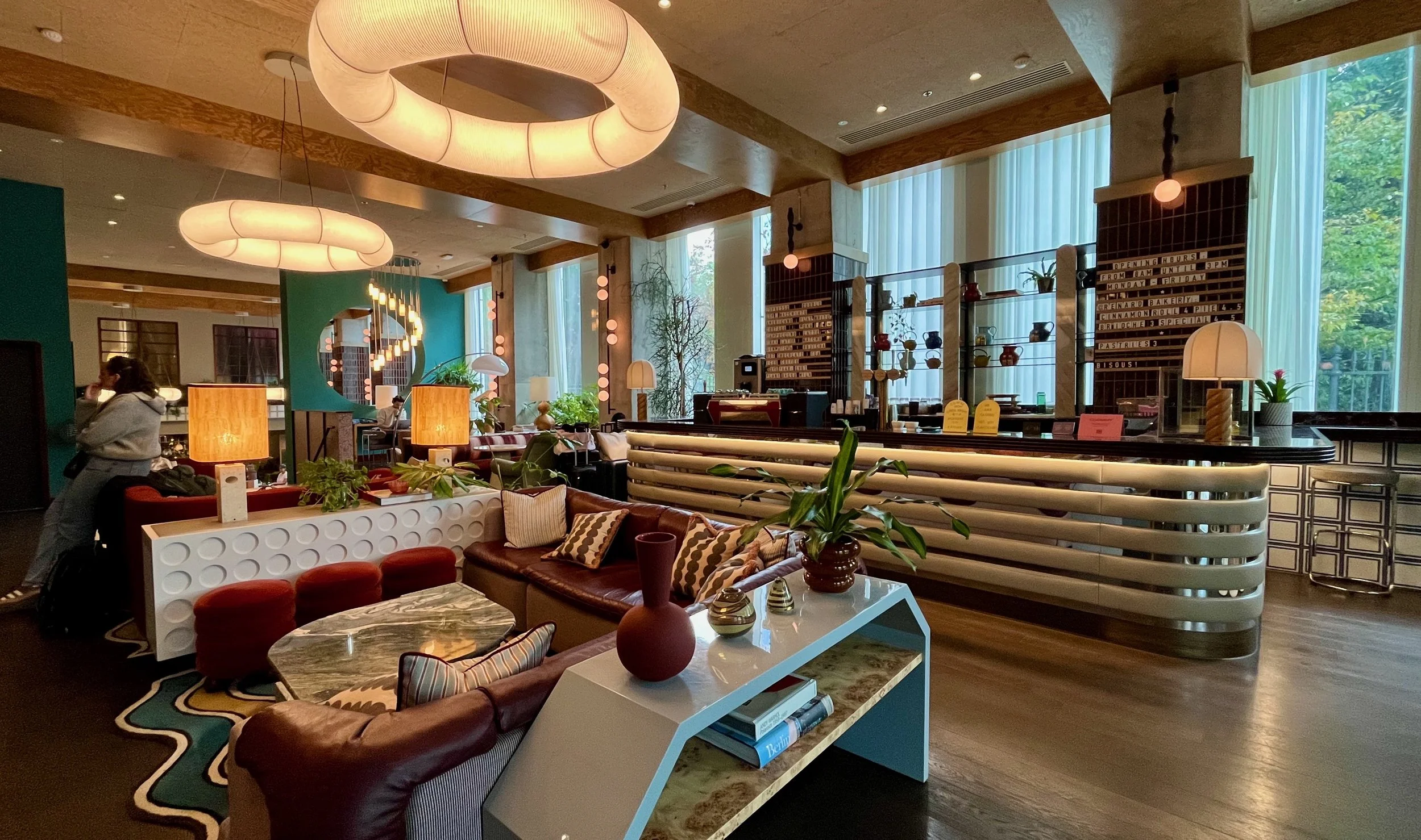
I stood there for a full minute, just taking it in.
Not because of the expensive furniture. Not because of the trendy rug.
But because they’d nailed the three invisible things that make any space feel designed.
The same three things I see in every professionally designed room, whether it’s a $500-a-night hotel or a tiny studio flat.
They’re not flashy. They’re not expensive.
But without them, even a $15,000 sofa looks amateur.
Foundation 1: Stop choosing colors like you’re at a pick-n-mix
Ever notice how designer rooms feel pulled together, even with completely different furniture styles?
It’s the palette.
Photos by Kaitlin Green
Not just “I like blue and grey.” That’s how amateurs think.
Professionals get specific:
Start with 5 colors:
2 colors that you love
2 neutrals to calm things down
1 wild card for interest
Then, and this is crucial, get specific.
Not “green.” Is it sage? Olive? Forest? Mint?
The specificity is what makes it feel intentional.
Here’s my dead-simple hack:
Use different intensities throughout the room. Lighter on walls, deeper on furniture, muted in accessories.
Suddenly, your random furniture collection looks curated.
Foundation 2: One overhead light is killing your vibe
Walk into any professionally designed space. Count the light sources.
I guarantee there are at least three.
Meanwhile, most of us are sitting under a row of ceiling fixtures, wondering why our room feels like an interrogation chamber.
Here’s what designers actually do:
They layer light at three different heights:
Above eye level (pendants, ceiling fixtures)
Eye level (wall sconces, tall floor lamps)
Below eye level (table lamps, accent lights)
Three sources minimum. Per room.
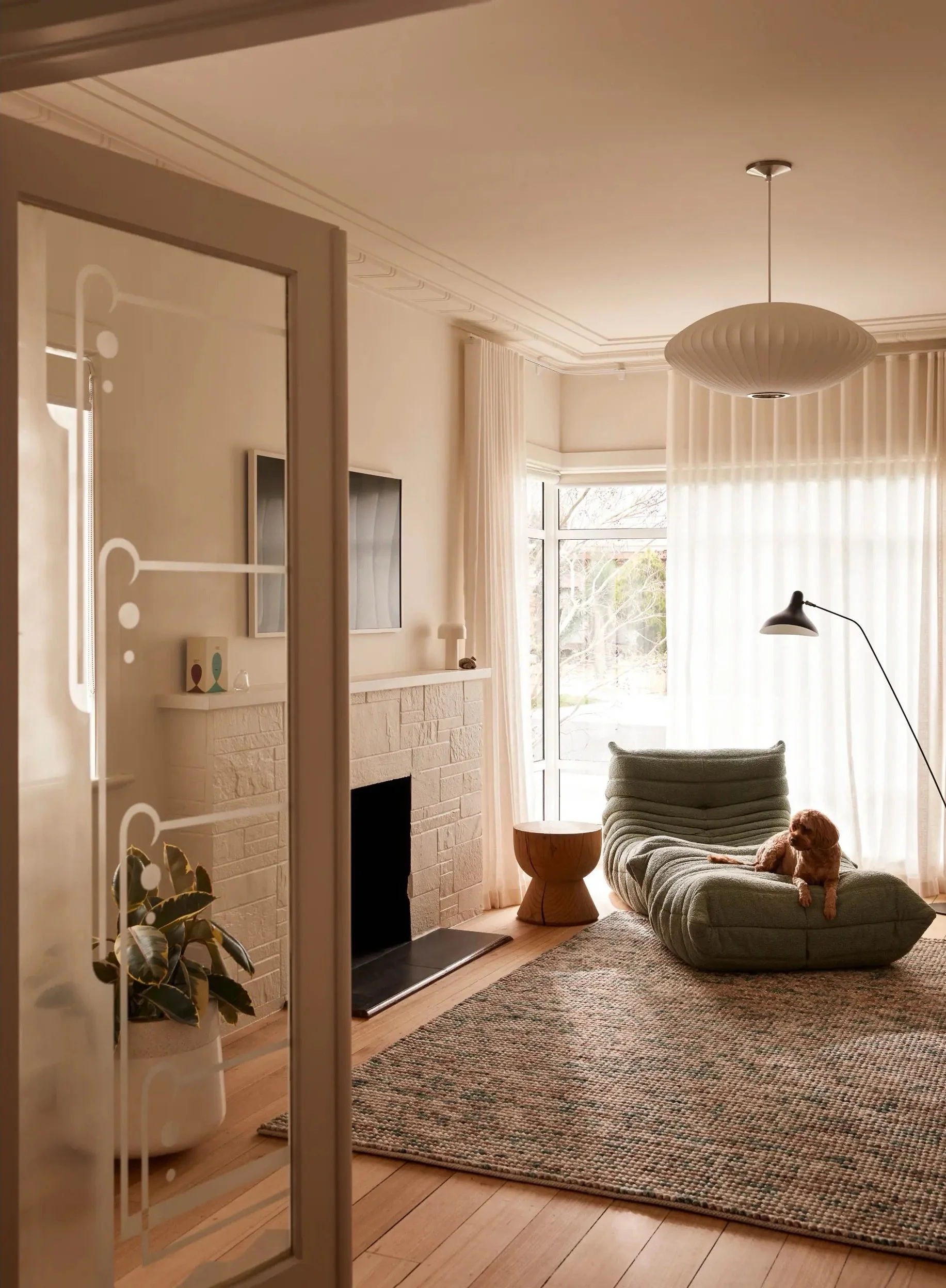

Photo by Martina Gemmola (left) & Photo by Adrienne Breaux (right)
The overlapping pools of light eliminate harsh shadows. Everything feels softer. Warmer.
And please - 2700K to 3000K bulbs for relaxing.
Anything cooler and you’re living in a hospital waiting room.
(If you’ve got standard builder-grade fixtures, swap just one for something with texture - rattan, linen, hammered metal.)
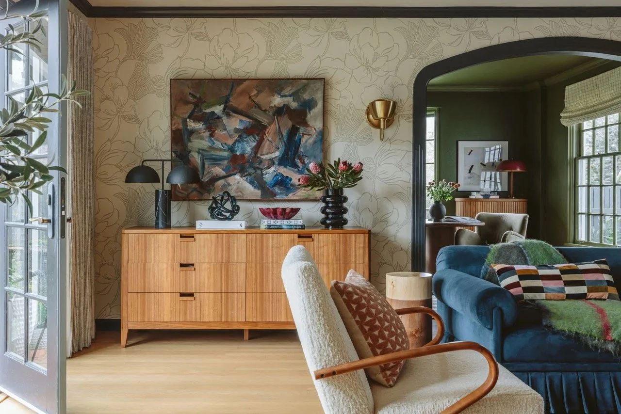
Foundation 3: Everything’s too smooth (or too rough)
This one’s subtle but game-changing.
Look at any beautiful room. Really look.


Photo by Nicole Franzen (left) & Photo by Samantha Weiss-Hills (right)
You’ll see wood next to metal. Linen against leather. Stone paired with glass.
The mix of textures creates depth. Interest. Life.
Most amateur rooms? Everything’s the same texture. Usually smooth.
Smooth walls, smooth furniture, smooth floors. It’s visually boring.
Here’s the fix:
For every smooth surface, add something with texture:
Rough against smooth
Matte against glossy
Soft against structured
Start with textiles - they’re the easiest. Throw pillows, blankets, rugs.
Natural materials, whenever possible. They look better and feel better. Synthetic materials catch light differently and often look cheap even when they’re new.
Layer different textures in the same color family. A chunky knit throw on a smooth leather sofa. A jute rug under an oak coffee table.
The contrast makes everything more interesting.
Here’s the thing:
These three foundations work in any style. Modern, traditional, bohemian, whatever.
They’re not about taste. They’re about understanding how spaces actually work.
I spent years buying and rearranging furniture, thinking that was the answer.
Turns out I was rearranging deck chairs on the Titanic.
Fix the foundations first. Everything else falls into place.
Cheers,
Reynard