Neutral ≠ Timeless (and what to do about your boring neutral home)
Neutral ≠ Timeless
I was at an open house last weekend. Gorgeous exterior. Nice layout. Great bones.
But then I stepped inside.
Beige on beige on griege.
It felt like someone dipped a marshmallow in instant coffee and called it interior design.
This is the trap: thinking neutral = timeless.
Let’s unpack why.
The Neutral Lie
Neutrals are sold as “safe.”
They’re the no-regrets palette. The mature, sensible choice. The thing you won’t get sick of ever (apparently).
But safe is just another word for forgettable.
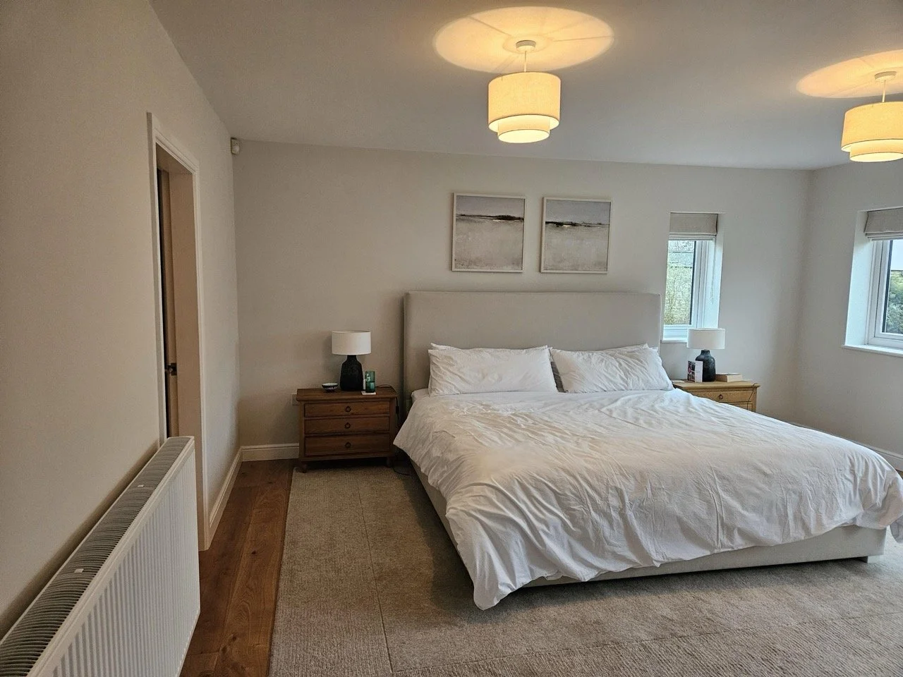
Exhibit one: Off-white walls. A grey bed frame. Boring, neutral abstract artworks. Some white cushions and a taupe rug.
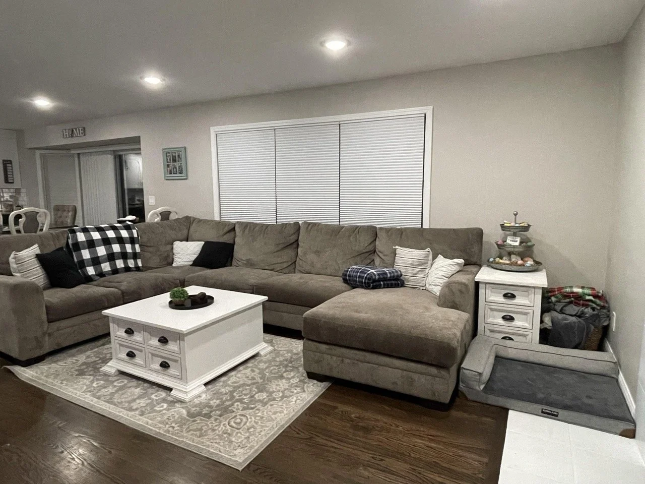
Exhibit two: Light grey walls. A dark greige sectional sofa. White coffee table. Grey rug.
Suddenly, your living room looks like an Airbnb no one’s booked since 2022.
Why?
Because there’s no contrast. No depth. No tension.
And when that “timeless” neutral falls out of fashion, looking at you, sad greys of the 2010s, your whole room crashes with it.
What Is Timeless?
It’s not a colour. Its composition.
Timeless design has: depth (light + shadow, and layers you want to touch), tension (contrast between style, colour, and/or texture) & interest (a clear focal point and unexpected elements).
Can a neutral room do this? Absolutely.
But only if you design it. Not default to it.
How to Rescue a Boring Neutral Room
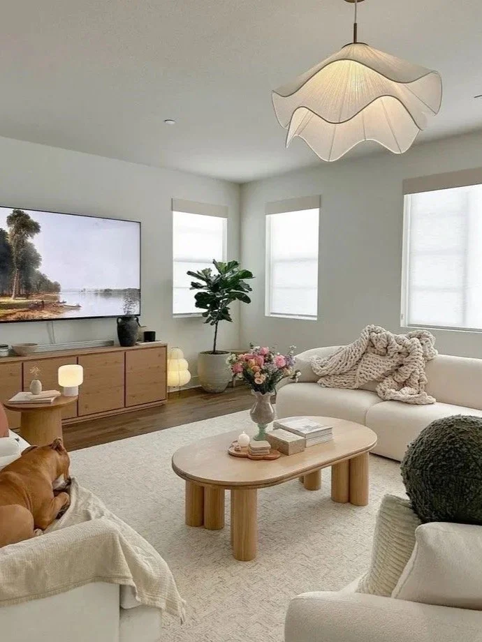
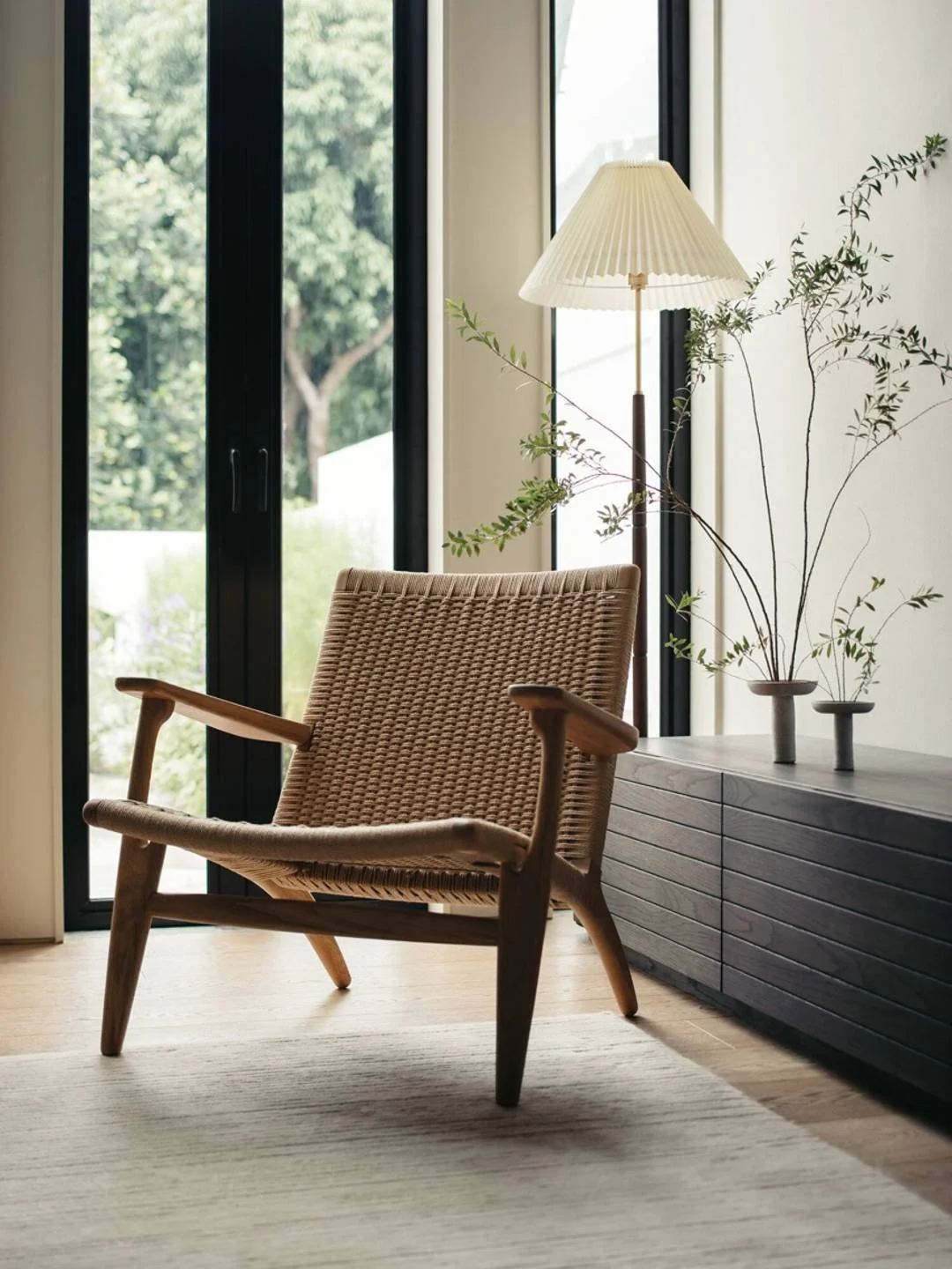
1. Lead With Shape
No colour? Then the shape does all the talking.
Sculptural chairs. Curvy lamps. Brutalist tables.
At least one bold, iconic piece is a non-negotiable.

Lisa Hu Home (left) & Design by Simone Polk (right)
Left: The sculptural pendant lights and table lamps are a smart way to bring eye-catching shapes and visual interest into this neutral space.
Right: This living room is full of sculptural forms, but the standout is the one-seater Togo sofa.
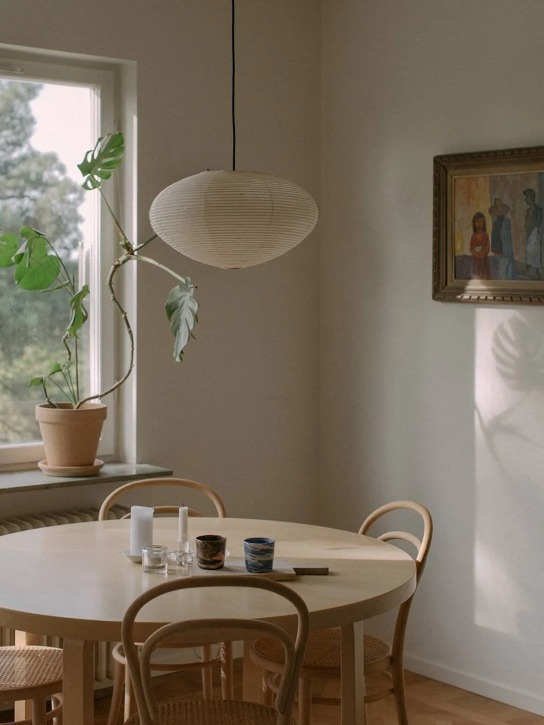
2. Layer Texture Like A Winter Outfit
Flat = bad.
Tactile = good.
Mix linen, leather, raw rood, ceramic, boucle, steel, etc.
Avoid the lifeless trio: MDF, plastic, and faux anything.
Pro Tip: Vintage pieces are often texture goldmines.
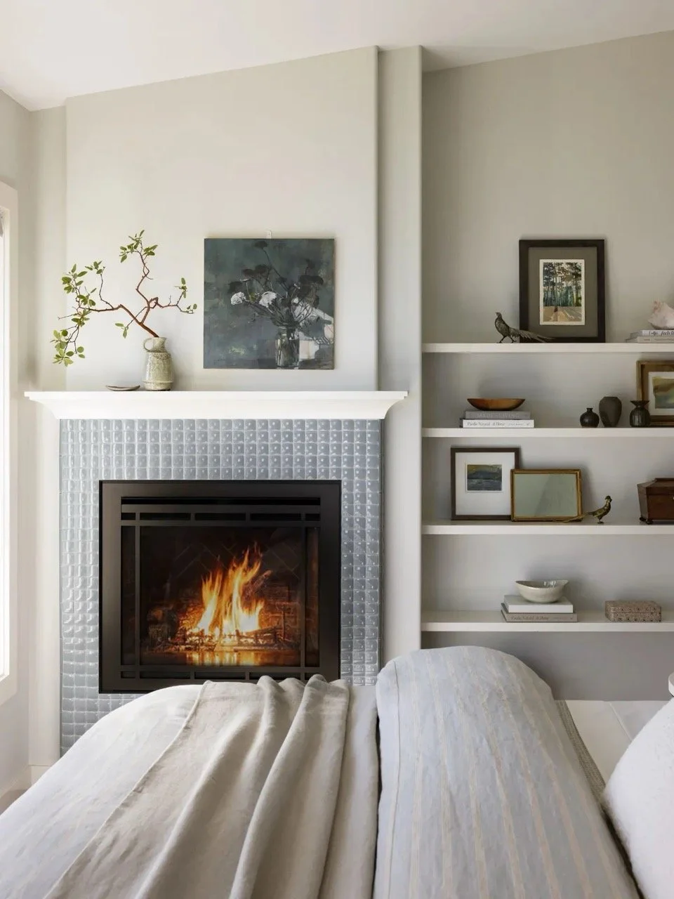
Notice how rich layering transforms this neutral space. From the tiled fireplace to the natural bed linens and the mix of materials on the shelves.
Even the whites have been thoughtfully varied: off-white walls, a crisp white mantel and shelves, and a subtly different white shade on the ceiling.
3. Build Contrast (Without Colour)
Contrast doesn’t just come from colour. It’s a variation in anything.
Here are some ideas:
Ceramic lamp on a raw wood console (matte vs glossy)
Warm beige upholstery with black steel legs (warm vs cool)
White walls paired with rich walnut wood (light vs dark)
4. Stop Panic Buying Throw Pillows
Teal cushions will not save your boring neutral room.
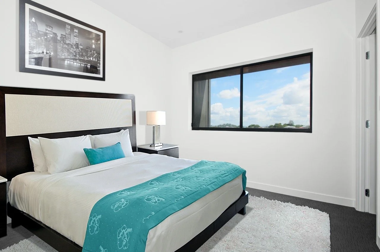
Unsplash
Accent colours work only when they’re intentional and echoed.
Pick one hue. Then echo it in different shades across different materials.
For example, a rust-toned velvet cushion, a terracotta vase, and an artwork with a hint of the same hue.
5. Add Plants
Plants are the ultimate neutral-room cheat code. They add colour, texture, shape, and life.
There’s a reason why every great neutral space you’ve seen has a plant or two lurking in the corner.
Real is best, but don’t dismiss faux. Just don’t go for the stiff, plasticky IKEA grass everyone owns.
Shape the branches. Make it feel organic, not factory-made.
Design by TE-EL (left) & Design by Amanda Rodriguez (right)
So, Is Neutral Bad?
No.
It’s just harder than it looks.
If your neutral room feels flat, don’t blame the colour. Blame the lack of shape. The missing texture. The zero contrast.
Cheers,
Reynard