4 red flags to spot before you sign or build a new home
If you're designing a new home, building from scratch, or hunting for your next place…
This one's for you.
Because the mistakes I'm about to share aren't things you can fix with a coat of paint or some new cushions.
They're baked into the bones of a home.
And once you've signed the contract or poured the slab, you're stuck with them.
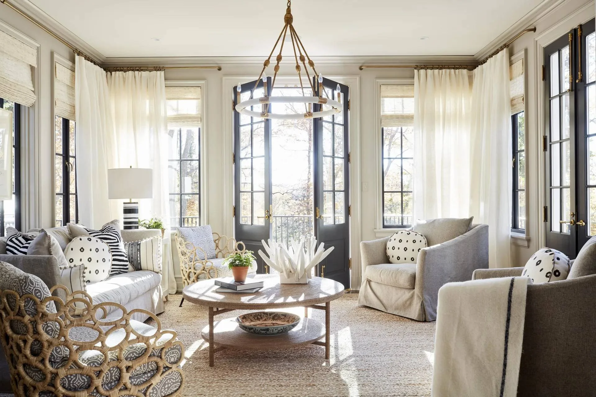
I've walked through hundreds of homes that looked great on paper.
Beautiful finishes. Expensive furniture. Clever storage.
And yet… something felt wrong.
Not wrong in a way you could immediately point to.
More like a persistent itch you couldn't scratch.
Most people blame the décor. But the real culprit is usually much deeper.
Layout and orientation.
So today, I want to walk you through the biggest layout red flags to watch for before you commit.
Red Flag #1: Ignoring which way your home faces
Orientation is how your home sits in relation to the sun.
Sounds simple. But it controls everything:
How hot or cold your home feels
How much light are you getting
How comfortable your living spaces are year-round
If orientation wasn't considered when the house was designed, you'll spend your life fighting the climate instead of working with it.
In Australia, north-facing living areas are generally ideal. The low winter sun warms your home naturally, and with proper horizontal shading, you can block the harsh summer sun.
Janie Molster
Now, not every home can face true north. Site constraints, street orientation, and block shape all play a role.
But what you want to watch for is when orientation has been completely ignored.
Living rooms facing west with no shading (hello, afternoon oven).
Giant unshaded windows on the east or west (glare city).
Prime north-facing walls wasted on garages or laundries when they could have been living spaces.
If you're in the northern hemisphere, flip this logic. You're aiming for Solar South.
When orientation is badly handled, comfort will always feel like an uphill battle. It's very hard to fight the sun. And very expensive to try.
Red Flag #2: Bedrooms too close to the action
A well-laid-out home has three clear zones:
Public (living, dining, & kitchen)
Private (bedrooms)
Utility (bathrooms, laundry & storage)
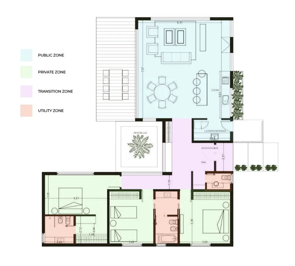
When these zones blur together, daily life becomes noisy and frustrating.
The big red flag? Bedrooms directly next to noisy living rooms or kitchens.
Sound transfer becomes a constant issue. Especially in newer builds with lightweight walls and hollow-core doors.
If your bedroom wall backs onto a TV wall, you'll feel every explosion and every late-night movie.
Red Flag #3: Too many doors in one room
This one often catches people off guard.
A room with too many entry and exit points becomes incredibly hard to use.
I once helped a subscriber with a living room that had five doorways. Five. Evenly spaced around the perimeter.
It looked fine when it was empty.
But it was impossible to furnish properly.
Too many doors mean no uninterrupted wall space, furniture pushed awkwardly into the centre, and door swing eating into usable area.
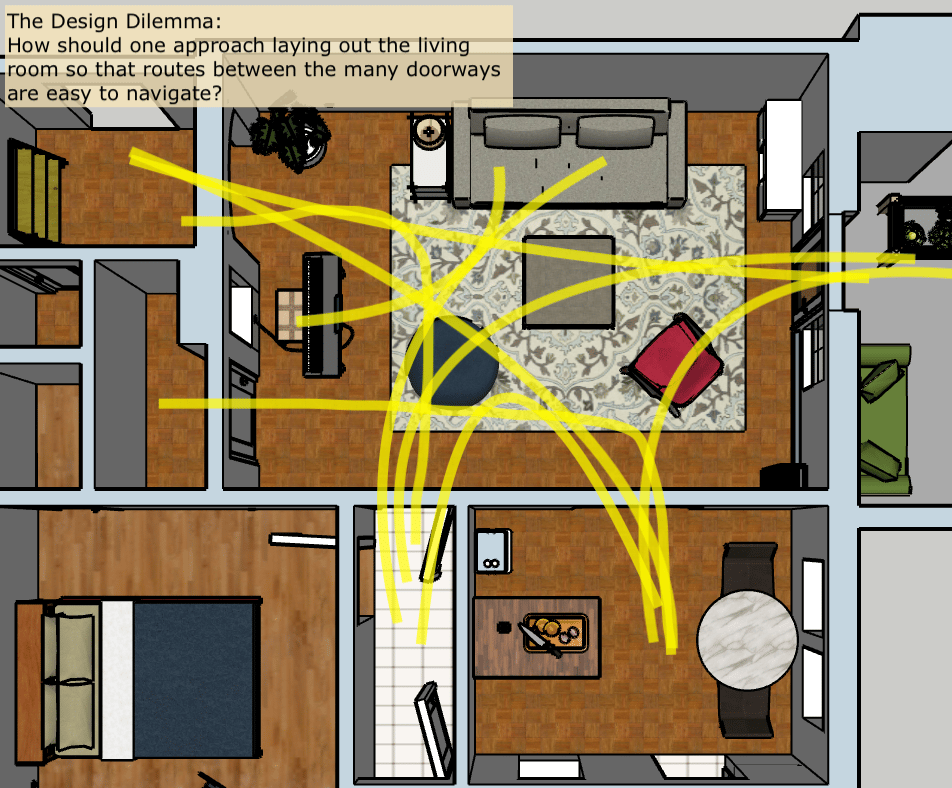
Subscriber Home Layout
If every wall is a thoroughfare, it’s hard to anchor the room.
So when you're inspecting a home or reviewing floor plans, count the doors. Then imagine where a sofa, bed, or sideboard would actually go.
If there's nowhere obvious, that's your answer.
Red Flag #4: Furniture fighting for its life
Sometimes the layout problem is already telling on itself.
If you walk into a home and notice furniture blocking walkways, chairs crammed too tightly around tables, and sofas pushed into odd angles just to make things work…
That's often not a styling issue.
It's a layout issue.
The furniture is fighting the floor plan. And the floor plan is winning.
What makes this worse is that many of these issues are avoidable. But only if layout is considered early, before you commit.
There are heaps more interior design red flags! Learn about them in this video:
Cheers,
Reynard