Good furniture won't save a bad layout
Most people think that if they buy the right furniture, their room will look great. But that’s only half the battle.
The best rooms aren't just furnished well, they're arranged well.
And layout is one of those sneaky things that's invisible when it works. When it doesn't? You can feel something's wrong, but you can't quite put your finger on it.
Maybe you've pushed everything to the edges to create that light, airy feel. But now the room feels hollow, like a dentist's waiting room with nicer cushions.
The furniture isn't the problem. Where you've put it is.
Let me walk you through the biggest layout mistakes I see, and what to do instead.
Wallflower syndrome
You know that person at a party who stands against the wall all night, hoping nobody notices them?
That's what most people's furniture is doing.
The instinct makes sense: push things to the edges to open up the floor. But when every piece hugs the walls, the centre of the room becomes a dead zone. It doesn't feel open. It feels empty.
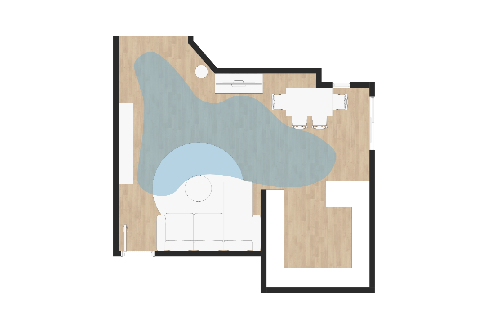
The fix? Decide where the main zones of your space are, then decorate within those areas.
Pull the sofa away from the wall. Drop a rug to visually anchor the space. Float a chair and a side table on it.
Give your furniture permission to step into the room.
Now, every rule has its exception. If your space is narrow, having a sofa against the wall is perfectly fine. Context matters.
But if you do float your sofa, put something around it. A console, a lamp, a side table, or a few plants. It gives the space a finished "background," so it doesn't feel like your sofa is just… adrift.
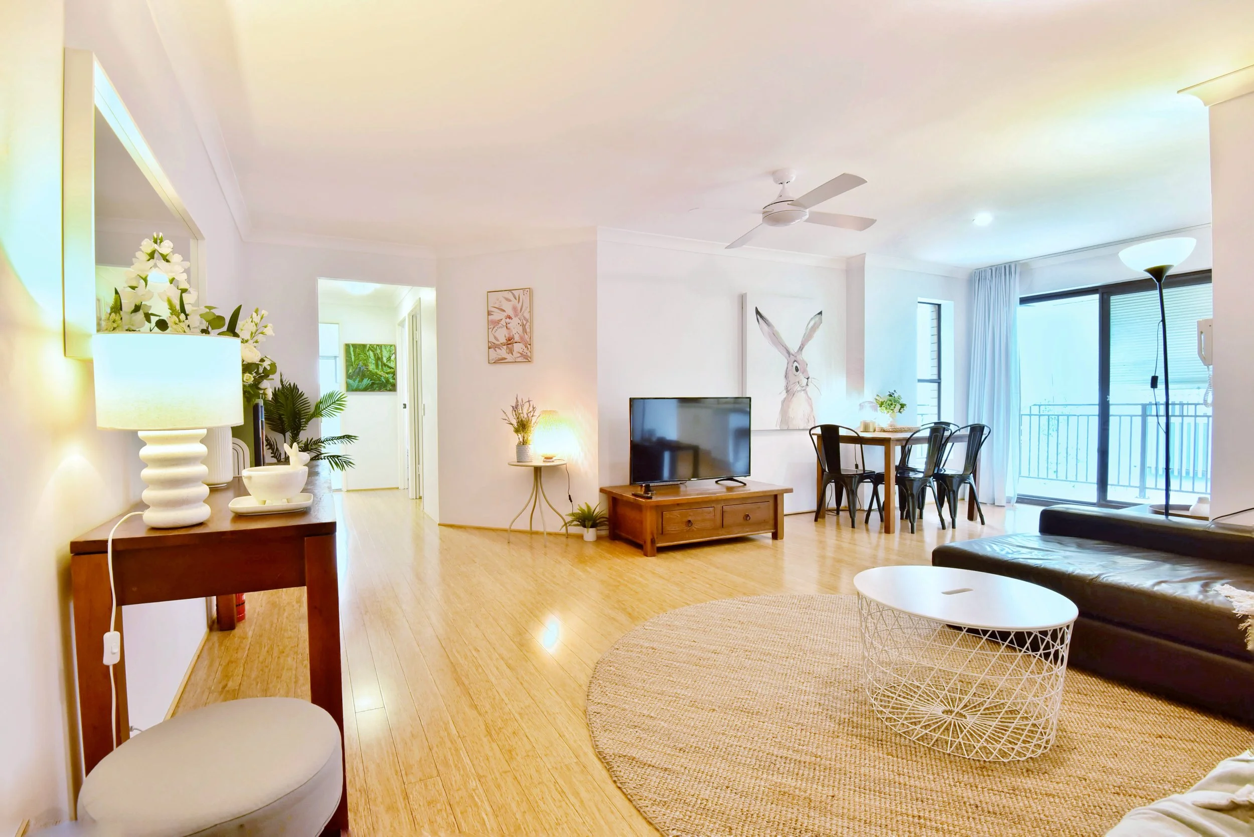
Treating big rooms like a single space
This is a classic one. People look at a large room and see one big area to fill.
That's exactly what makes it feel cold and cavernous.
Big rooms need structure. Think of them less like a single canvas and more like a map with distinct territories (or states).
A small side table near the door? That's your entry zone. A seating group by the fireplace? Gathering spot. A reading chair in the corner with a good lamp? Private corner.
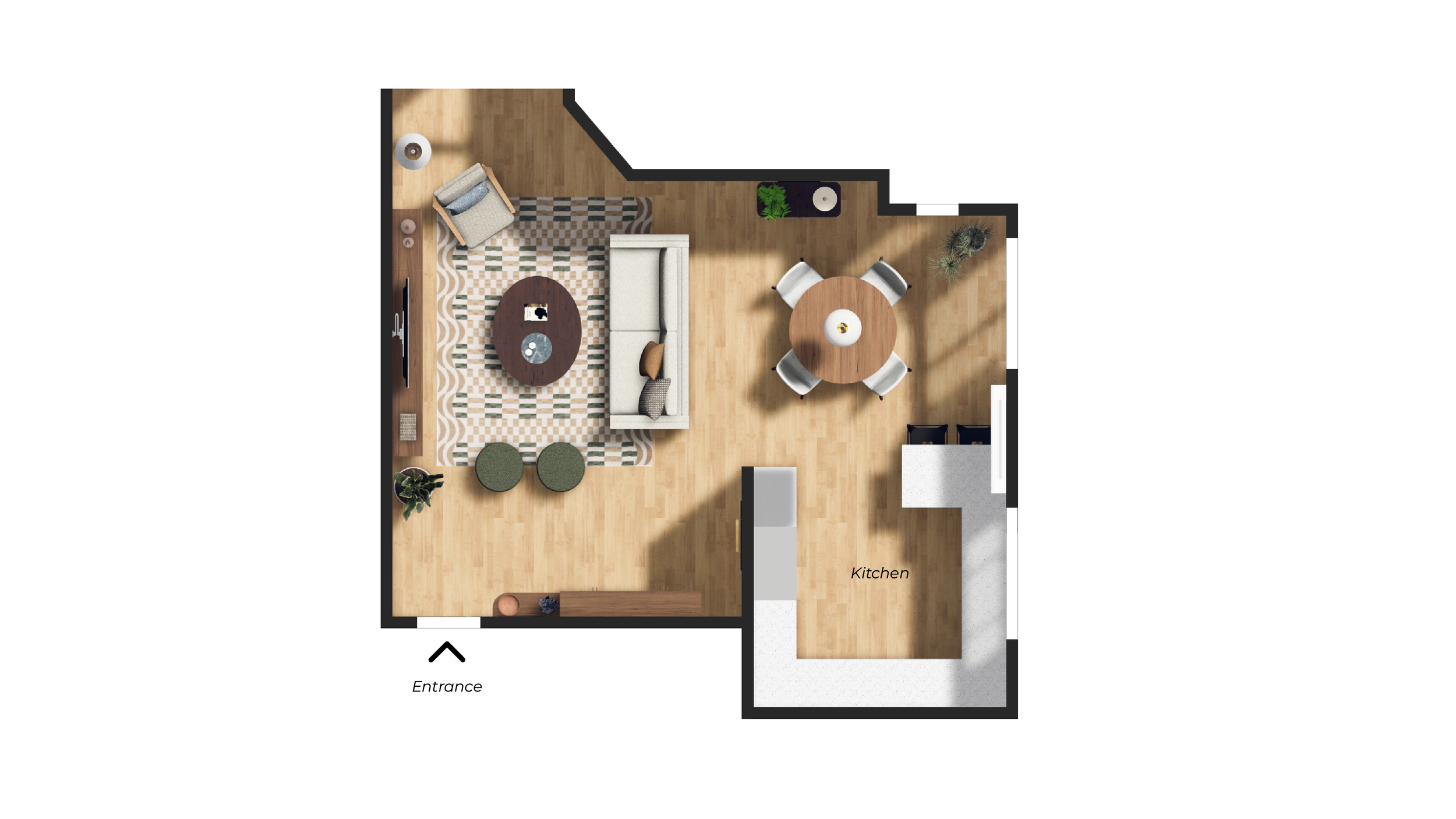
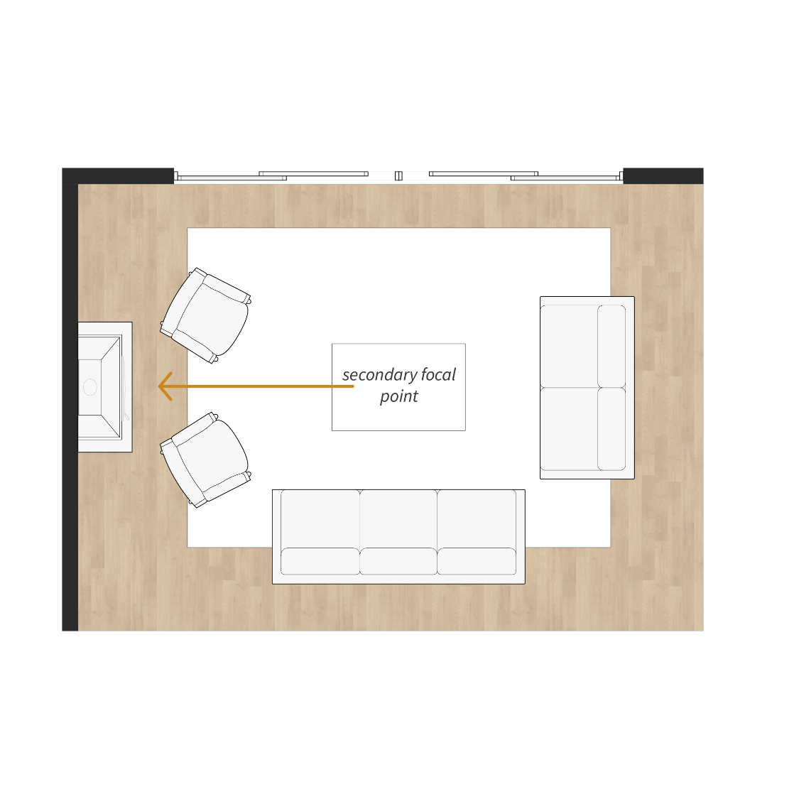
Design & That Studio
Look at the room above. It's divided into three distinct zones. A nook in the corner, the main lounge, and a wet bar/cabinetry on the left.
What holds it all together is circulation. Every zone needs clear pathways around it so people can move through the room naturally.
And if you're wondering how to define those zones without building actual walls: rugs.
Rugs are brilliant at creating visual boundaries without any physical division. One of the most underused tools in layout design.
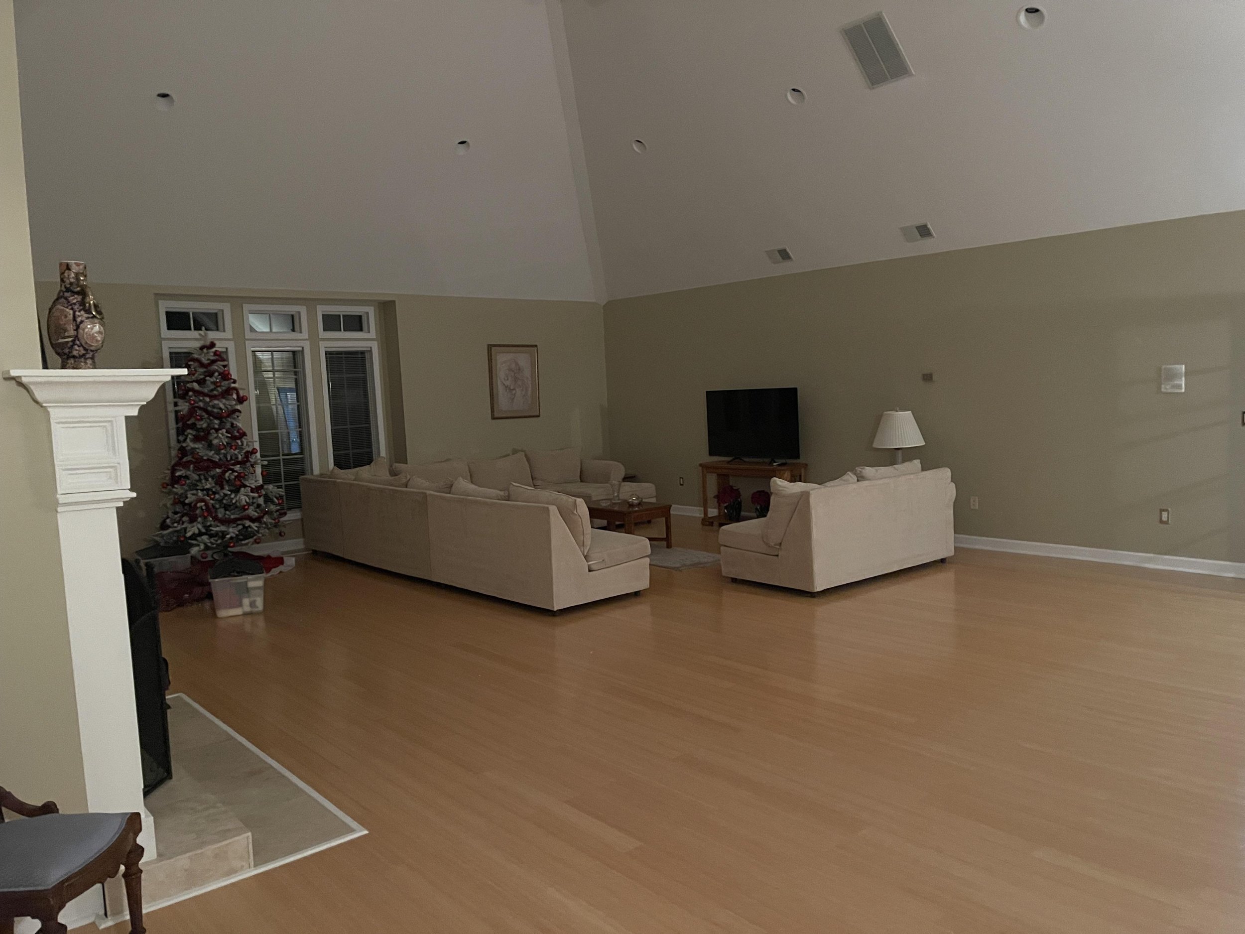
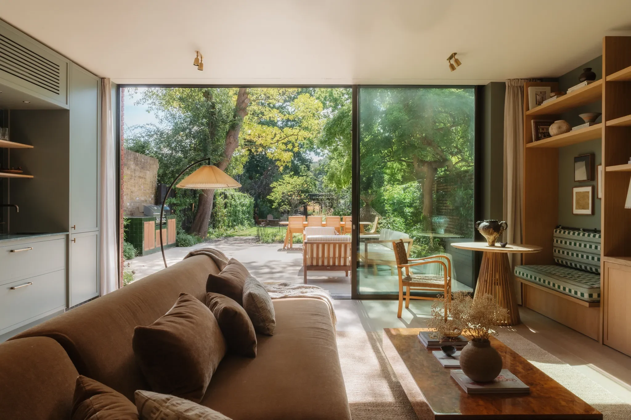
No clear focal point
If nothing in the room anchors your attention, your eyes bounce around like a pinball.
The space feels disorganised, and you can't quite work out why.
It might look like a sofa pointing at nothing. Or a room trying to serve a TV, a fireplace, and a view — all at once.
Having multiple features is fine. Giving them equal visual weight is the problem.
Pick one primary anchor. Choose it based on how the room gets used every day. If you've got a view worth appreciating, orient around that. A strong art piece or a fireplace can do the same job.
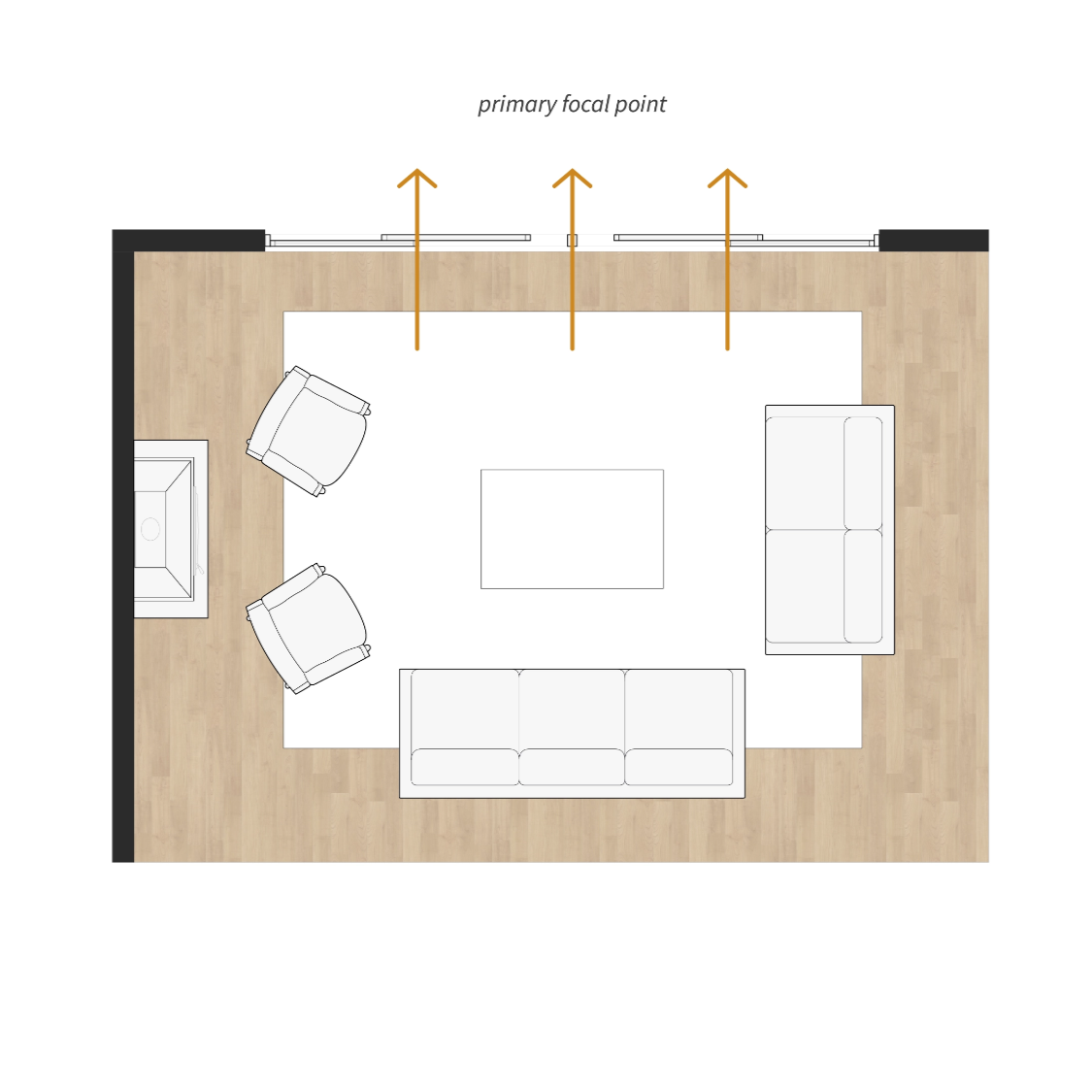
And if you have two competing focal points — say a TV and a fireplace — assign each a role. The primary one gets the best seat and a straight-on orientation. The secondary gets an angled chair.
Blocking traffic flow
This is the most important one.
Traffic flow is the path people take to move through a room. If you're squeezing past a chair every time you walk to the kitchen, your room will never feel relaxing.
And nothing kills a good conversation like someone saying "excuse me" every two minutes just to pass through.
The mistake is placing furniture first and then trying to make the flow work around it. It should be the other way around.
Identify the most important routes first. Entry to seating. Seating to kitchen. Protect those routes. Then arrange furniture in the calmer pockets that remain.
This principle should always come before aesthetics.
Layout isn't glamorous. Nobody pins "great traffic flow" on Pinterest.
But it's the difference between a room that looks good in photos and one that actually feels good to live in.
Cheers,
Reynard